The Allen Design Language System :
A Technical Study.
The Allen Design Language System : A Technical Study.
We built a unified Design System to bring clarity, consistency and simplicity across the learning experience at Allen.
We built a unified Design System to bring clarity, consistency and simplicity across the learning experience at Allen.
This comprehensive case study details the design system architecture, foundations, and system-level decisions of the Allen Design Language System (DLS). Our goal was to build a unified system that brought clarity, consistency, and simplicity to the learning experience. This study proves the system's ability to scale across platforms and content types, positioning it as a robust, architecturally sound solution.
This comprehensive case study details the design system architecture, foundations, and system-level decisions of the Allen Design Language System (DLS). Our goal was to build a unified system that brought clarity, consistency, and simplicity to the learning experience. This study proves the system's ability to scale across platforms and content types, positioning it as a robust, architecturally sound solution.
Duration
Duration
8 months
8 months
Platform
Platform
Mobile, tablet, desktop
Mobile, tablet, desktop
Outcome
Outcome
93.2%
CSAT - look and feel
3-4 hours
Manpower saved per person per day
45+
core components
40-50k
Inserts per week on Figma
Guiding Principles.
The Guiding Principles define the character and mandate of the Allen Design Language System (DLS). Each principle dictated specific technical choices within the system's token structure and component architecture, providing explicit guardrails for scale and consistency.
The Guiding Principles define the character and mandate of the Allen Design Language System (DLS). Each principle dictated specific technical choices within the system's token structure and component architecture, providing explicit guardrails for scale and consistency.
1. Clarity: Optimise for Academic Focus
Typography, spacing, and layout establish a clean hierarchy, ensuring students can effortlessly focus on content. The system must eliminate visual clutter and present information predictably to aid comprehension.
Typography, spacing, and layout establish a clean hierarchy, ensuring students can effortlessly focus on content. The system must eliminate visual clutter and present information predictably to aid comprehension.
2. Calmness: Reduce Visual Stress
The system is primarily unobtrusive and must reduce the cognitive load inherent in high-stakes test preparation. Neutral backgrounds, minimal elevation , and quiet interactions create a reassuring environment for learning.
The system is primarily unobtrusive and must reduce the cognitive load inherent in high-stakes test preparation. Neutral backgrounds, minimal elevation , and quiet interactions create a reassuring environment for learning.
3. Approachability: Build a Friendly, Encouraging Tone
The visual tone must balance academic rigour with a friendly character, recognising the user base are still young students. This is conveyed through soft shapes and welcoming typography.
The visual tone must balance academic rigour with a friendly character, recognising the user base are still young students. This is conveyed through soft shapes and welcoming typography.
4. Purposeful Delight: Support, Don't Distract
Delight is carefully calibrated to support focus, not distract from it. Every expressive element (colour, motion, illustration) must have a clear purpose: to teach, guide, or clarify, never to stand out for its own sake.
Delight is carefully calibrated to support focus, not distract from it. Every expressive element (colour, motion, illustration) must have a clear purpose: to teach, guide, or clarify, never to stand out for its own sake.
5. Technical Flexibility: Scale Without Losing Identity
The system must be engineered to adapt naturally across devices (Mobile, Tablet, Desktop) and content types without losing its core identity. This requires tokenization and robust architecture.
The system must be engineered to adapt naturally across devices (Mobile, Tablet, Desktop) and content types without losing its core identity. This requires tokenization and robust architecture.
Foundations.
The DLS foundations define the core visual and structural rules, shaping how color communicates meaning, how space is used, and how typography adapts. Every foundation element is token-driven, which is the key architectural decision enabling scale and consistency across light/dark mode and device types.
The DLS foundations define the core visual and structural rules, shaping how color communicates meaning, how space is used, and how typography adapts. Every foundation element is token-driven, which is the key architectural decision enabling scale and consistency across light/dark mode and device types.
Colour.
Colour in the Allen Design Language System is built to support clarity and calmness while enabling purposeful delight. The colour palette was chosen to be light, academic and approachable.
The architecture enables seamless switching between light and dark modes via Figma modes, with shadows and gradients also tied to tokens to ensure consistent behaviour.
The DLS utilises a strict semantic naming convention (e.g., Background/primary, Typography/default-title). This is crucial for clarity, detailing the intention of the colour and ensuring every designer and developer is clear on where and how to use it.
The DLS utilises a strict semantic naming convention (e.g., Background/primary, Typography/default-title). This is crucial for clarity, detailing the intention of the colour and ensuring every designer and developer is clear on where and how to use it.

Colour library structure
Colour roles
Colour roles
Neutral backgrounds : We rely on neutral backgrounds to provide a quiet canvas. Surfaces across both light and dark modes remain balanced and unobtrusive.
Neutral backgrounds : We rely on neutral backgrounds to provide a quiet canvas. Surfaces across both light and dark modes remain balanced and unobtrusive.
Primary brand blue : The brand's identity is carried by a refined primary blue. This colour was modified from the original Allen brand colour to ensure it brings more brightness and energy, making it perform optimally on digital interfaces, especially for key interactive components like primary buttons.
Primary brand blue : The brand's identity is carried by a refined primary blue. This colour was modified from the original Allen brand colour to ensure it brings more brightness and energy, making it perform optimally on digital interfaces, especially for key interactive components like primary buttons.
Subject & Functional Hues : These colours are reserved for functional states (e.g., success, error, warning) and gentle moments of distinction (e.g., subject-based navigation or context).
Subject & Functional Hues : These colours are reserved for functional states (e.g., success, error, warning) and gentle moments of distinction (e.g., subject-based navigation or context).
Accessibility Mandate: Typography colours are rigorously tuned for clarity against both backgrounds and fills, strictly adhering to adhering to AAA contrast standards for all text on background combinations. This ensures ensures maximum readability and accessibility (A11y).
Accessibility Mandate: Typography colours are rigorously tuned for clarity against both backgrounds and fills, strictly adhering to adhering to AAA contrast standards for all text on background combinations. This ensures ensures maximum readability and accessibility (A11y).
Typography.
Typography in the Allen Design Language System is built for clarity and comfort. We use Plus Jakarta for its open, balanced letterforms, which stay readable at small sizes and bring a friendly tone to dense learning content.
Typography in the Allen Design Language System is built for clarity and comfort. We use Plus Jakarta for its open, balanced letterforms, which stay readable at small sizes and bring a friendly tone to dense learning content.
The system is fully semantic. Style names such as Label/Base-bold or Title/Large-bold clearly express each type role’s purpose, size tier, and weight.
All typography attributes - font size, line height, weight, and family are token-driven, enabling Figma’s device modes to map each text role one-to-one across mobile and desktop. This tokenised structure allows type to scale consistently on every platform, with tablet using the mobile scale, preserving hierarchy and significantly reducing both design and development effort.

Typography structure : one to one mapping between device modes
For components that must remain visually stable, such as buttons and compact controls, the system uses static type styles. These do not scale with device modes, ensuring consistent heights and touch targets. Static styles exist only inside system components and are not published broadly, keeping usage clear and intentional.
For components that must remain visually stable, such as buttons and compact controls, the system uses static type styles. These do not scale with device modes, ensuring consistent heights and touch targets. Static styles exist only inside system components and are not published broadly, keeping usage clear and intentional.
Together, these decisions create a typographic foundation that is readable, predictable, and flexible while maintaining precise control where it matters.
Together, these decisions create a typographic foundation that is readable, predictable, and flexible while maintaining precise control where it matters.
Spacing.

Primitive number scale
Spacing in the Allen Design Language System is built from a shared primitive number scale, which acts as the foundation for both spacing and radius tokens.
The spacing tokens use a delta of 2 for smaller increments, giving designers precise control in dense text and component layouts. Beyond 20px, the increments expand to support larger structural spacing across sections and page layouts.

Spacing tokens

Spacing guidelines for pages
Clear guidelines define spacing relationships between titles and body text, within cards, and across major sections ensuring every surface feels open, balanced, and predictable.
Clear guidelines define spacing relationships between titles and body text, within cards, and across major sections ensuring every surface feels open, balanced, and predictable.
Corner radius.
Corner radii are derived from the same primitive scale as spacing, creating a unified visual logic across the system.
The set ranges from 0, 4, 8, 12, 16, 24, 32, 40 to a full radius, offering flexibility while maintaining consistency.
Corner radii are derived from the same primitive scale as spacing, creating a unified visual logic across the system.
The set ranges from 0, 4, 8, 12, 16, 24, 32, 40 to a full radius, offering flexibility while maintaining consistency.

Radius tokens

Usage guidelines
Usage guidelines shape the tone of the interface:
24px for primary cards and large surfaces to create a friendly, approachable character.
16px for medium-height cards.
12px for compact or low-height elements.
8px and below for chips, pills, and micro-interactions.
This hierarchy ensures components feel appropriate to their scale while staying visually cohesive.
Layout grids.
Our layout grids begin with understanding how students actually use the product. Around 60 - 65% access Allen on mobile, 20% on desktop, and 10% on tablet. Among desktop users, 80% use a 1440px viewport and 90% stay within 1600px, giving us clear optimisation boundaries.
Our layout grids begin with understanding how students actually use the product. Around 60 - 65% access Allen on mobile, 20% on desktop, and 10% on tablet. Among desktop users, 80% use a 1440px viewport and 90% stay within 1600px, giving us clear optimisation boundaries.


Layout grid structure
Mobile and tablet follow a fluid content width with fixed margins to utilise the space of these smaller devices. Desktop behaves differently.
Given the density of content on each page, we identified use cases for 3 different layout grids:
Mobile and tablet follow a fluid content width with fixed margins to utilise the space of these smaller devices. Desktop behaves differently.
Given the density of content on each page, we identified use cases for 3 different layout grids:
1. Pre-purchase pages : Medium content density use cases such as landing and course detail screens.
2. Post-purchase L0 pages : Low content density screens with the main side panel, which sits outside the grid and maintains a consistent 20px margin.
The grid applies only to the content region, which is lighter and more card-driven.
3. Post-purchase inner pages (L1, L2, L3…) : Higher content density screens without the main side panel. These receive a wider maximum content width, optimised for reading and scanning.
The top navigation maintains a consistent 20px margin for all pages.
This hierarchy ensures components feel appropriate to their scale while staying visually cohesive.
Exception - All video player pages are full width experiences with a consistent 20px margin on all sides.
Exception - All video player pages are full width experiences with a consistent 20px margin on all sides.
Elevation.
Elevation in the Allen Design Language System is intentionally minimal. Most cards and surfaces don’t use shadows at all - their background colour already provides enough contrast from the page. This keeps the interface calm, reduces visual noise, and lets content remain the focus.
Elevation in the Allen Design Language System is intentionally minimal. Most cards and surfaces don’t use shadows at all - their background colour already provides enough contrast from the page. This keeps the interface calm, reduces visual noise, and lets content remain the focus.

Shadows are introduced only when meaningful distinction is required. Elements like floating tabs, bottom navigation bars, sticky containers, chat input fields, or cards that share the same background as their parent surface may use elevation to signal separation or priority.
Shadows are introduced only when meaningful distinction is required. Elements like floating tabs, bottom navigation bars, sticky containers, chat input fields, or cards that share the same background as their parent surface may use elevation to signal separation or priority.
The system includes three levels - Low, Medium, and High, each using a diffused shadow with no X or Y offset, mimicking a soft overhead light. Shadow colours are tied to design system tokens so elevation behaves consistently across light and dark modes.
The system includes three levels - Low, Medium, and High, each using a diffused shadow with no X or Y offset, mimicking a soft overhead light. Shadow colours are tied to design system tokens so elevation behaves consistently across light and dark modes.
This restrained approach keeps depth predictable and unobtrusive, allowing elevation to guide attention only when it truly matters.
This restrained approach keeps depth predictable and unobtrusive, allowing elevation to guide attention only when it truly matters.
Motion.
Motion in the Allen Design System is intentional, expressive, and carefully tuned. Every movement is designed with a clear purpose: to teach, guide, or clarify what just changed, never to animate for its own sake. Interactions respond in ways that reinforce structure and reduce cognitive load, helping learners stay oriented.
Motion in the Allen Design System is intentional, expressive, and carefully tuned. Every movement is designed with a clear purpose: to teach, guide, or clarify what just changed, never to animate for its own sake. Interactions respond in ways that reinforce structure and reduce cognitive load, helping learners stay oriented.

Delight curve from the motion guidelines
At the same time, motion carries the personality of the product - youthful, warm, and encouraging - adding gentle moments of delight without pulling focus from learning. Transitions stay smooth, precise, and quiet, crafted to feel confident and supportive rather than loud or flashy. Whether it’s a checkbox, a dropdown, a modal, or a full-page transition, motion is calibrated to strike the right note, making the interface feel clear, caring, and trustworthy.
At the same time, motion carries the personality of the product - youthful, warm, and encouraging - adding gentle moments of delight without pulling focus from learning. Transitions stay smooth, precise, and quiet, crafted to feel confident and supportive rather than loud or flashy. Whether it’s a checkbox, a dropdown, a modal, or a full-page transition, motion is calibrated to strike the right note, making the interface feel clear, caring, and trustworthy.
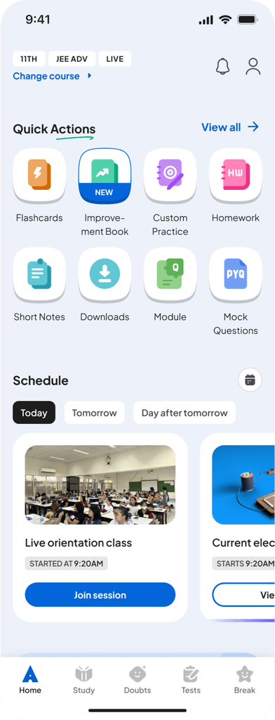
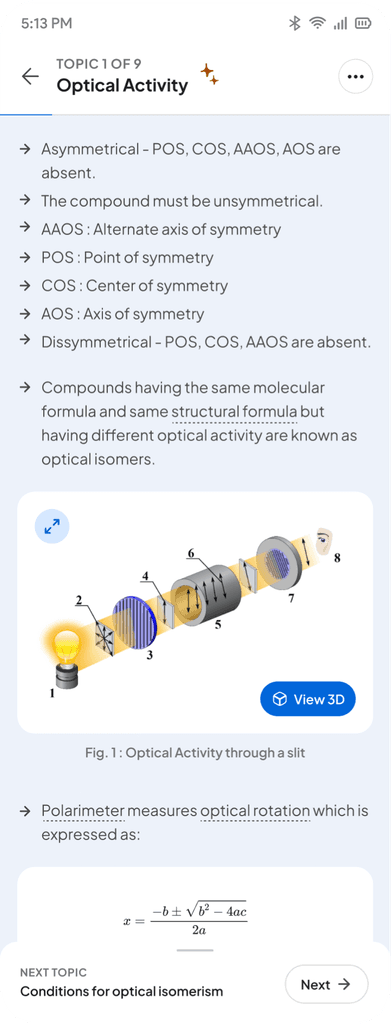
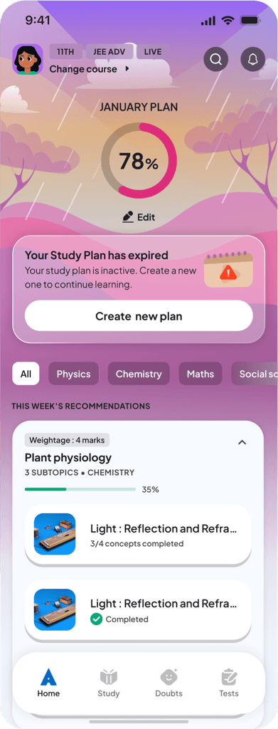
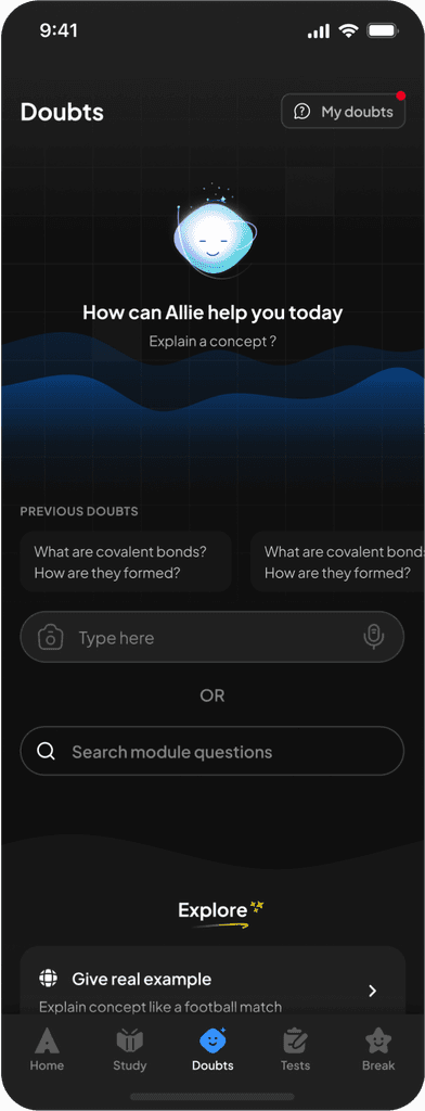
Components.
The component library translates the foundations of the Allen Design Language System into the reusable building blocks. It contains 45 core components, which expand into over 1,200 components including variants, nested components, and platform adaptations. Every component is designed to behave predictably, with clear properties, consistent structure, and intentional rules across devices.
The component library translates the foundations of the Allen Design Language System into the reusable building blocks. It contains 45 core components, which expand into over 1,200 components including variants, nested components, and platform adaptations. Every component is designed to behave predictably, with clear properties, consistent structure, and intentional rules across devices.
For example, a property like Icon-Right: with the boolean toggle reliably switches the icon-right on or off layout across components. More complex components, such as drop-downs, cards, and bottom sheets, are composed of nested components, with all relevant nested properties made visible along with parent properties for easier editing and clarity.
Certain components, such as buttons, maintain the same size across devices through static typography, ensuring consistent tap targets on mobile and desktop. Other components, like drop-downs or inputs, follow device-aware sizing rules, allowing them to adapt appropriately to screen format while keeping their core behaviour intact.
These principles create components that are flexible when they need to be and stable when consistency matters.
Component categories.
Components are grouped into functional families that reflect how the product is built:
Buttons (default and circular buttons)
Inputs & Form Controls (all form fields, search fields, message fields, drop-downs, checkboxes, radios, toggles)
Navigation (top navigation, bottom navigation, side panel navigation for desktop, tabs, segmented controls)
Cards & Containers
Feedback Elements (toasts, tool-tips, empty states)
Overlays (bottom sheets and pop-ups)
Utility Components (chips, tags, badges, loaders, progress indicators)
Media & Learning Components (video controls, quick action)
Page control (dot indicators, pagination component, sliders)
Beyond functional components, the system also includes:
A full icon library, cleaned, optimised, and structured with an icon swap component and preferred value swapping
An illustration library
A banner system for the Marketing team, with two banner types - strip banner and default banner
Component documentation structure.
To keep usage consistent across teams, each component includes a lightweight, structured documentation model:
About - what the component is and where it is used
Anatomy - a breakdown of the component’s structural parts
How to Use - spacing, alignment, truncation, and content rules
When to Use - differentiation from similar components
Dos & Don’ts - quick guardrails for correct usage
Variants & Properties - labelled boards of every size, state, style, and configuration
This structure makes components easy to understand, adopt, and extend.

Component documentation for top nav
Patterns.
Patterns are reusable interaction frameworks that define how multi-step experiences behave across the product. They ensure that flows with similar intent share the same structure, navigation, tone, and decision points. While components provide the building blocks, patterns define how those blocks come together to create consistent user journeys.
Patterns are reusable interaction frameworks that define how multi-step experiences behave across the product. They ensure that flows with similar intent share the same structure, navigation, tone, and decision points. While components provide the building blocks, patterns define how those blocks come together to create consistent user journeys.
While working on feature tasks, I identified that several high frequency experiences are highly inconsistent across the app. These included :
While working on feature tasks, I identified that several high frequency experiences are highly inconsistent across the app. These included :
Practice flows
Success and failure screens
Review answer screens
Practice stood out as the most complex and consequential pattern. It touches every major learning surface from Custom Practice and Improvement Book to Tests, Score Booster, and more - making it foundational to the student’s experience in the app.
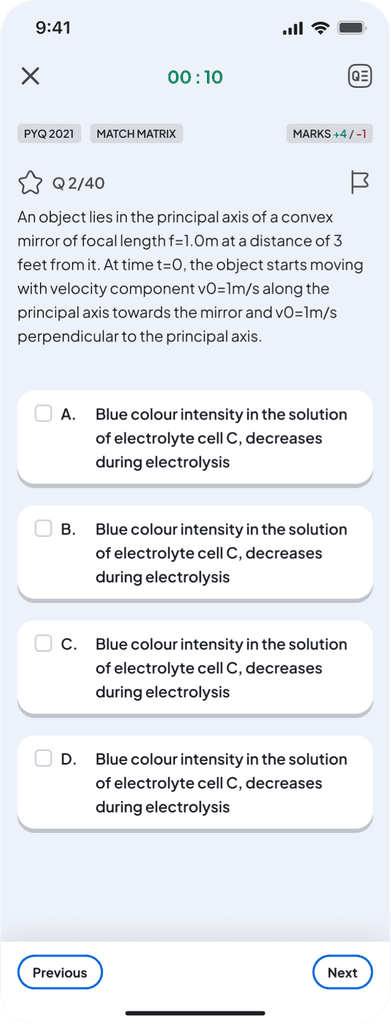
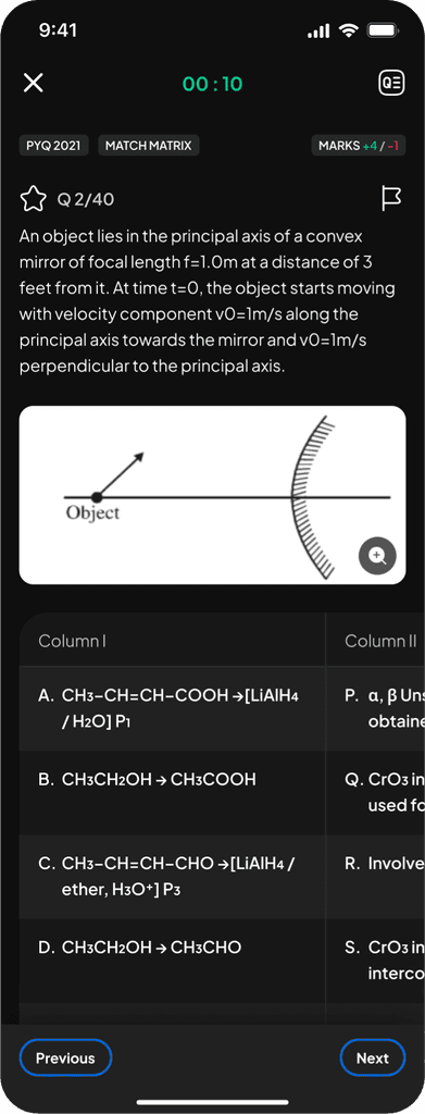
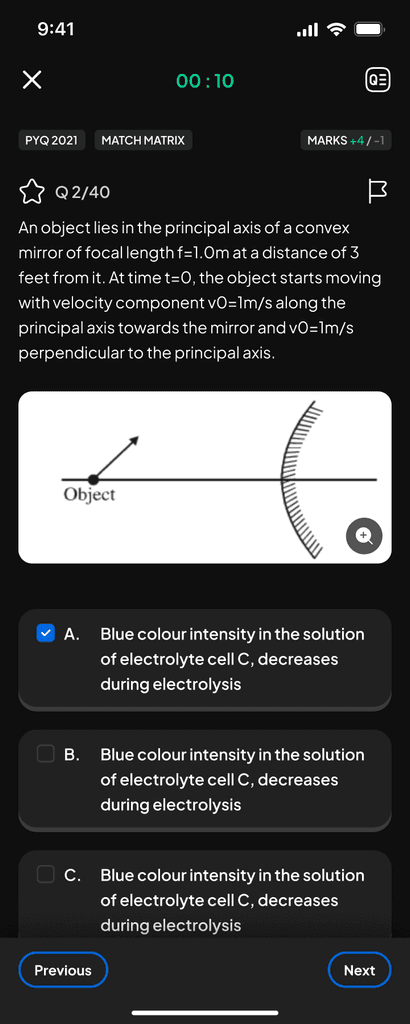
Practice experience pattern.
Practice was implemented differently in each feature - some used a third party interface, others used internally built modules with different layouts, tools, and navigation. This led to unpredictable behaviour and confusion for students.
Practice was implemented differently in each feature - some used a third party interface, others used internally built modules with different layouts, tools, and navigation. This led to unpredictable behaviour and confusion for students.

Modular practice components
We rebuilt Practice as a modular system with configurable tools:
timer
hint
bookmark
mark for review
supportive messages
attempt/reattempt behaviour
solution reveal logic
Each module can be turned ON or OFF depending on the feature.
Two core modes were defined:
Supportive Mode - hints, solutions, guidance, reattempts
Assessment Mode - focused navigation with solutions at the end
This set a consistent structure for all practice-based features while allowing flexibility where needed.
Governance.
A system is only as strong as its adoption. After building the foundations, our focus shifted to creating the structures that kept the Design Language System healthy, consistent, and trusted.
A system is only as strong as its adoption. After building the foundations, our focus shifted to creating the structures that kept the Design Language System healthy, consistent, and trusted.
Educating the team.
Whenever new components or major updates were introduced, we ran short, focused workshops. These sessions ensured every designer understood not just what changed, but why - and how to integrate the updates into their ongoing work.
Whenever new components or major updates were introduced, we ran short, focused workshops. These sessions ensured every designer understood not just what changed, but why - and how to integrate the updates into their ongoing work.
System checks before design work.
To prevent inconsistencies from re-entering the product, we introduced a mandatory System Check step.
Designers completed their initial visual direction, then paused to align every element with the DLS: spacing, component usage, typography, colours, patterns, and interactions.
Only after this check could they proceed to full flows or handoff.
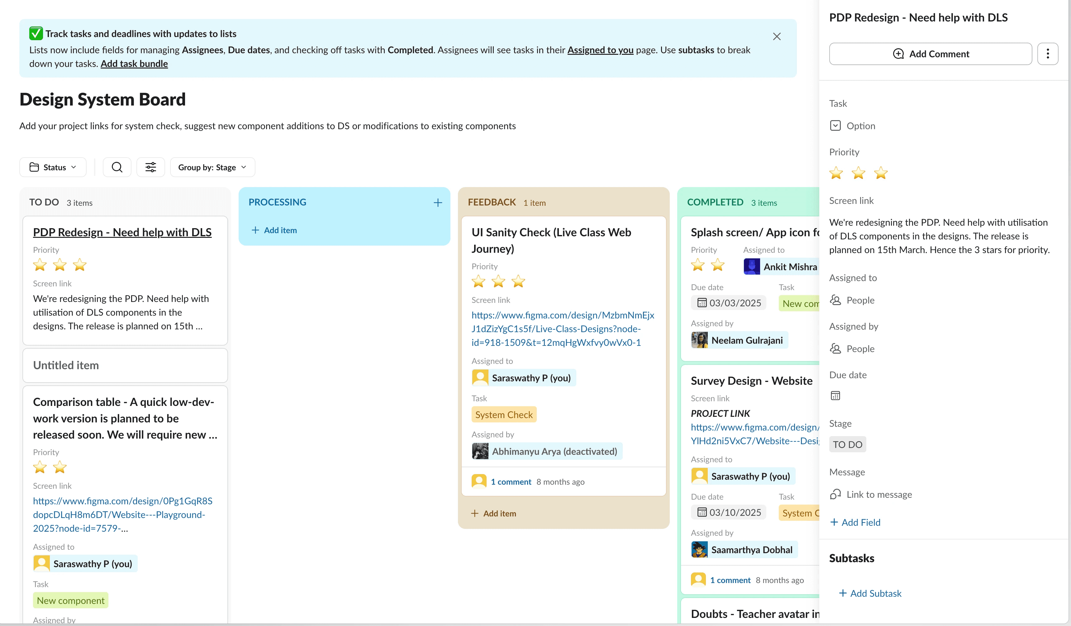
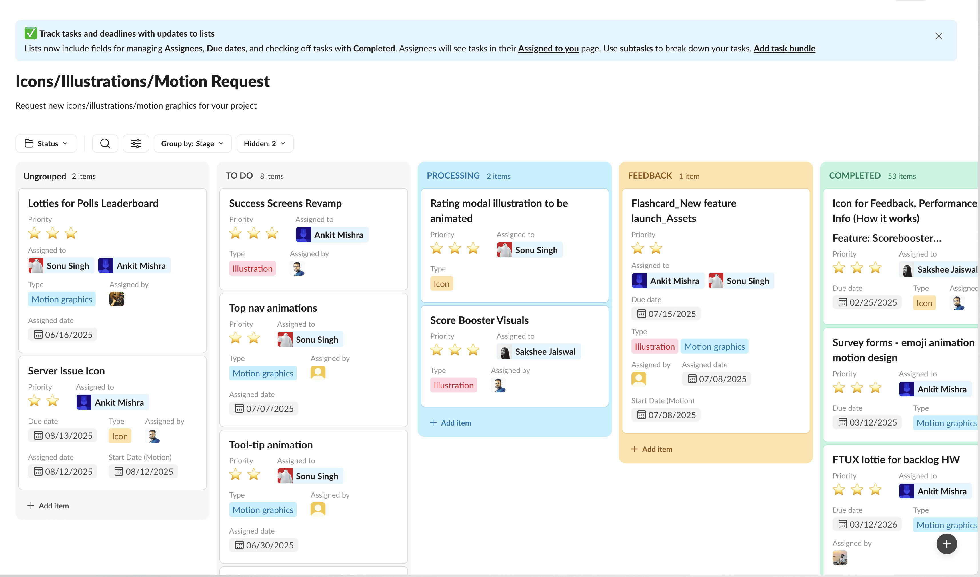
Clear intake for feedback and requests.
We created a dedicated Slack workflow to streamline system related requests. All DLS work - system checks, feedback tickets, component improvements, icon/illustration requests moved through one transparent board.
Teams could track progress, see what was in review, and understand when updates would land.
Something broken or not working as expected → log it.
Need a new component or variant → request it.
Missing icon or illustration → submit it.
This unified channel reduced ad-hoc pings and allowed us to prioritise rationally across pods and features.
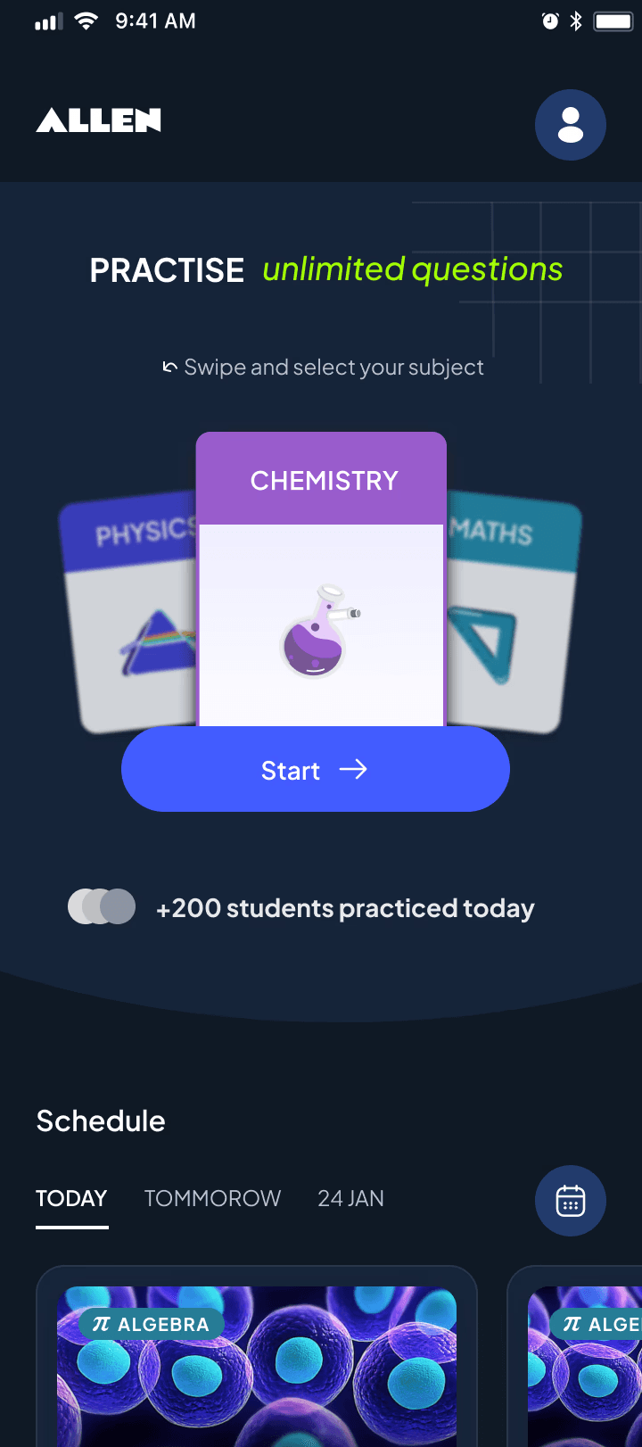
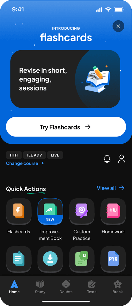
Our app before implementation of DLS.
Our app before implementation of DLS.

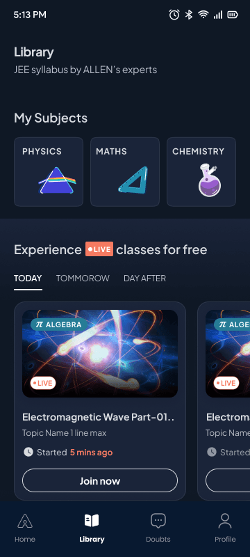

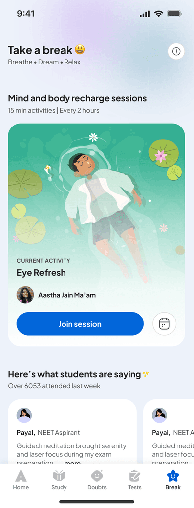
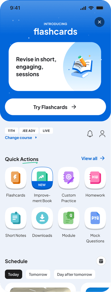
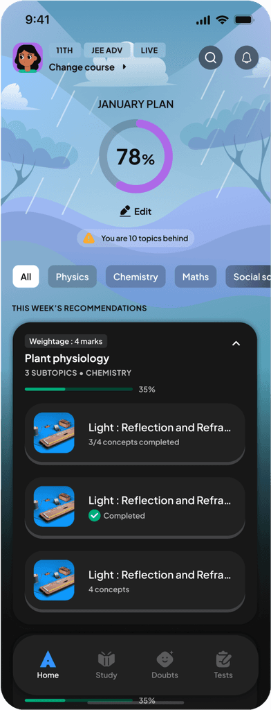
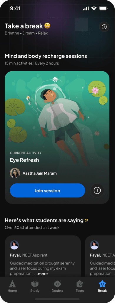
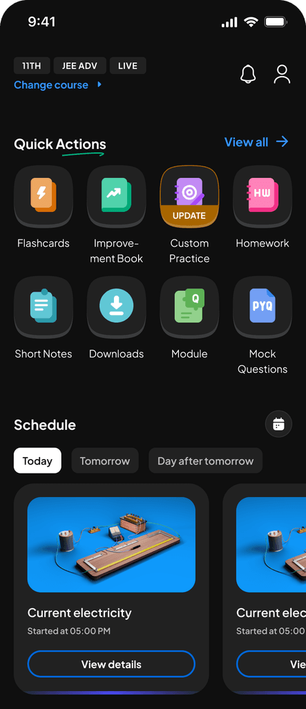
App post implementation of DLS.
App post implementation of DLS.
App post implementation of DLS.
Outcomes.
The Design Language System created measurable impact across design, development, and the student experience. The system now provides a foundation the product can grow on - stable, scalable, and ready for everything that comes next.
Higher User Trust and Sentiment.
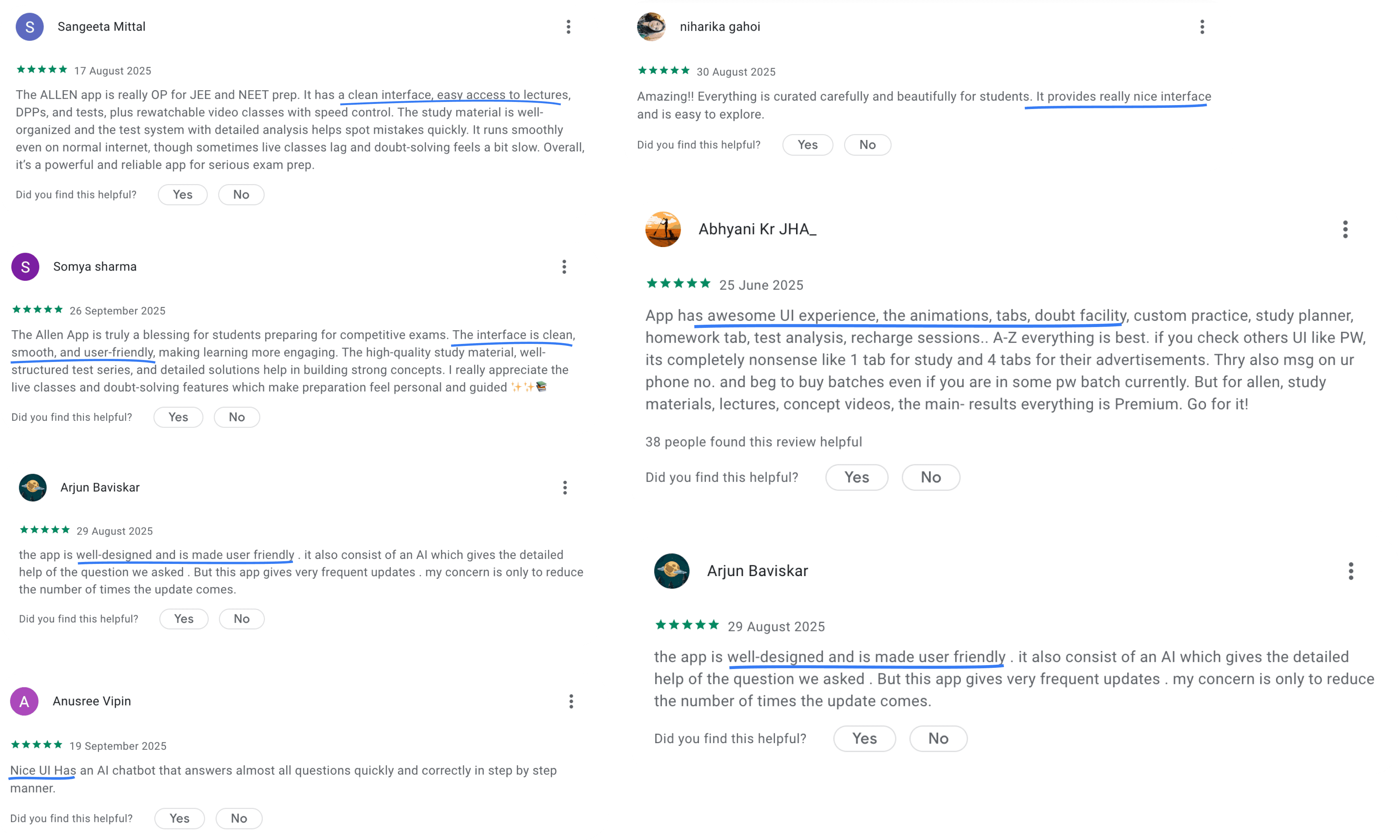
Students responded directly to the improved consistency and calmer visual language. CSAT for look & feel improved eventually improved from ~20% → 93.2%
The updated visual and interaction language increased trust in the product as a reliable study companion.
Significant productivity gains.
Based on an internal survey, designers and developers save an average of 3–4 hours per day when working with the Design System.
With 12 designers and 30 developers, the system supports: 42 team members saving ~3-4 hours per day and in a year has saved ≈ 32,760 - 43,680 hours.
Faster design-dev cycles.
Before the DLS, design-dev review loops could take 2-3 days, often due to spacing drift, misaligned components, and unclear variants.
With tokens, components, and system checks, review cycles now take 20-60 minutes, developer escalations dropped significantly, QA flagged far fewer visual inconsistencies, teams spent more time solving real problems, not UI rework
This made the delivery pipeline faster, clearer, and more predictable.
High system adoption across teams.
The system powers around 40-50k inserts per week on average as per Figma analytics, showing that design and development work rely heavily on system tokens, components, and patterns.
This reduces design drift, ensures consistent interaction behaviours, and improves velocity across all pods.
Outcomes.
The Design Language System created measurable impact across design, development, and the student experience. The system now provides a foundation the product can grow on - stable, scalable, and ready for everything that comes next.
Higher User Trust and Sentiment.
Students responded directly to the improved consistency and calmer visual language. CSAT for look & feel improved eventually improved from ~20% → 93.2%
The updated visual and interaction language increased trust in the product as a reliable study companion.
Significant productivity gains.
Based on an internal survey, designers and developers save an average of 3–4 hours per day when working with the Design System.
With 12 designers and 30 developers, the system supports: 42 team members saving ~3-4 hours per day and in a year has saved ≈ 32,760 - 43,680 hours.
Faster design-dev cycles.
Before the DLS, design-dev review loops could take 2-3 days, often due to spacing drift, misaligned components, and unclear variants.
With tokens, components, and system checks, review cycles now take 20-60 minutes, developer escalations dropped significantly, QA flagged far fewer visual inconsistencies, teams spent more time solving real problems, not UI rework
This made the delivery pipeline faster, clearer, and more predictable.
High system adoption across teams.
The system powers around 40-50k inserts per week on average as per Figma analytics, showing that design and development work rely heavily on system tokens, components, and patterns.
This reduces design drift, ensures consistent interaction behaviours, and improves velocity across all pods.
The team.
Lead by
Vinu Remesan
My role
Design tokens
Colour
Aa
Aa
Aa
Aa
Aa
Aa
Typography
Elevation
8px
16px
24px
Spacing
Corner radius
com
Components
Patterns
Icon library
Structures and processes
Layout grids
Training
Guidelines
Management
Sonu Singh
Motion
Sakshee Jaiswal & Ankit Mishra
Icon library
Illustration library
Development
Harshul Singla
Ashutosh Lasod
Ajay Nellori
Sachin Kumar
Sourabh Gupta
Shashirith P
and many more…
The team.
Lead by
Vinu Remesan
My role
Design tokens
Colour
Aa
Aa
Aa
Aa
Aa
Aa
Typography
Elevation
8px
16px
24px
Spacing
8px
16px
24px
Spacing
Corner radius
com
Components
Icon library
Patterns
Structures and processes
Layout grids
Training
Guidelines
Management
Sonu Singh
Motion
Sakshee Jaiswal & Ankit Mishra
Icon library
Illustration library
Development
Harshul Singla
Ashutosh Lasod
Ajay Nellori
Sachin Kumar
Sourabh Gupta
Shashirith P
and many more…
Open to new ideas, learnings and coffee chats.
+91 9667319653
saraswathyp.design@gmail.com
Made with love on Framer
© SARASWATHY 2025
Open to new ideas, learnings and coffee chats.
+91 9667319653
saraswathyp.design@gmail.com
Made with love on Framer
© SARASWATHY 2025
Open to new ideas, learnings and coffee chats.
+91 9667319653
saraswathyp.design@gmail.com
Made with love on Framer
© SARASWATHY 2025