Button
Button
Button
Button
Button
Button
Button
Button
Button
Increasing User Trust by Building the Design System.
In a "feature-first" environment, our product’s user experience had degraded significantly due to technical debt and visual inconsistency. The CSAT score for "Look and Feel" had hit a critical low of 20%, and design debt was actively slowing down feature velocity.
Working under the Design Director, I spearheaded the technical architecture and execution of our first Design System. By advocating for a rigorous semantic structure over "quick fixes", I standardised the platform's core foundations. The impact was transformative: the CSAT score climbed to 93.2% within one year, proving that design consistency acts as a business multiplier.
93.2%
CSAT - look and feel
3-4 hours
Manpower saved per person per day
45+
core components
40-50k
Inserts per week on Figma
Button
Button
Button
Button
Button
Button
Button
Button
Button
Increasing User Trust by Building the Design System.
In a "feature-first" environment, our product’s user experience had degraded significantly due to technical debt and visual inconsistency. The CSAT score for "Look and Feel" had hit a critical low of 20%, and design debt was actively slowing down feature velocity.
Working under the Design Director, I spearheaded the technical architecture and execution of our first Design System. By advocating for a rigorous semantic structure over "quick fixes", I standardised the platform's core foundations. The impact was transformative: the CSAT score climbed to 93.2% within one year, proving that design consistency acts as a business multiplier.
93.2%
CSAT - look and feel
3-4 hours
Manpower saved per person per day
45+
core components
40-50k
Inserts per week on Figma
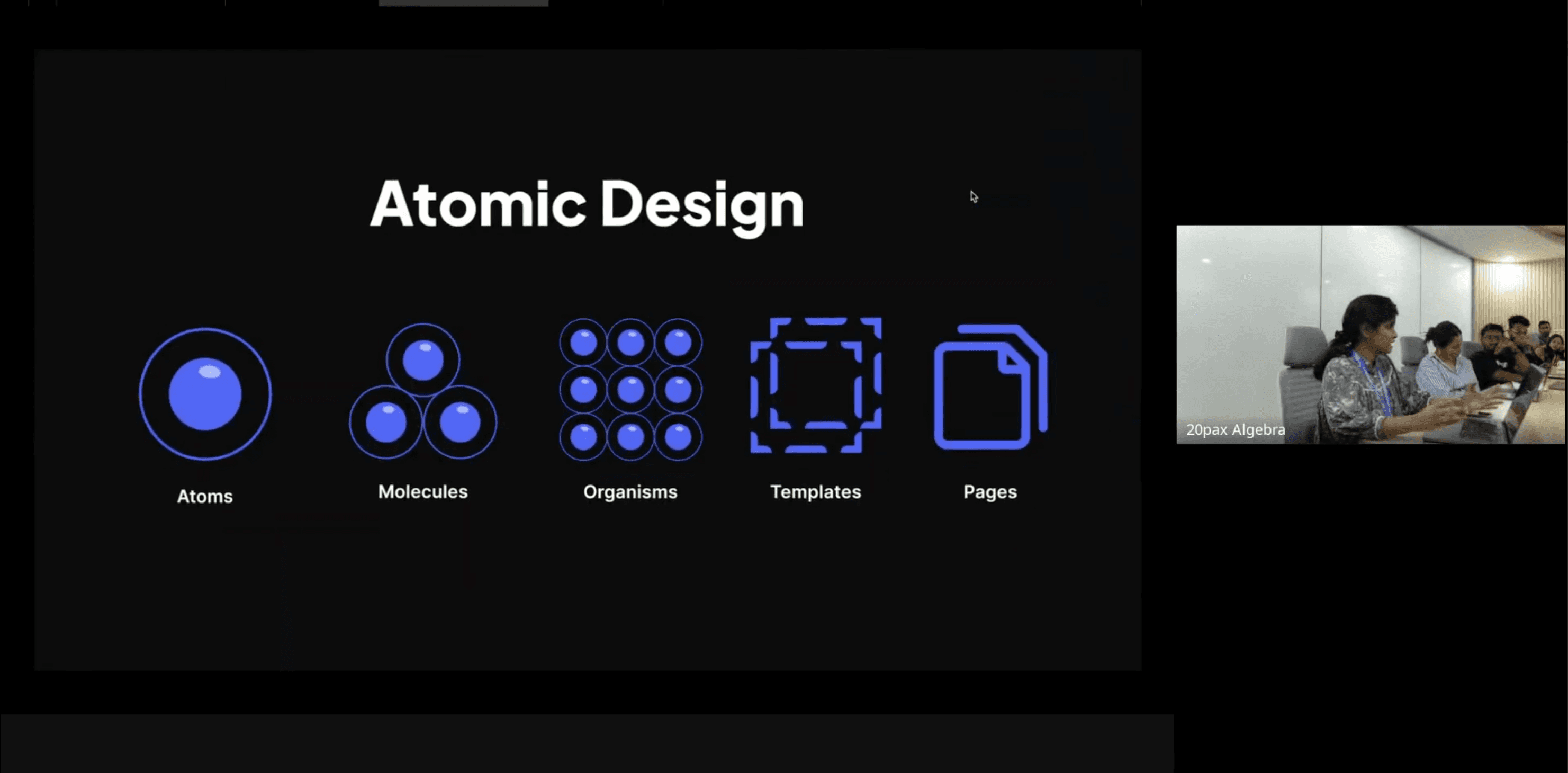
01. The Diagnosis: Why our Process was Broken.
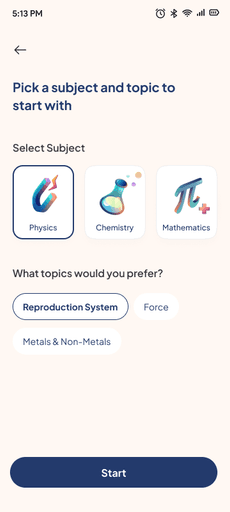
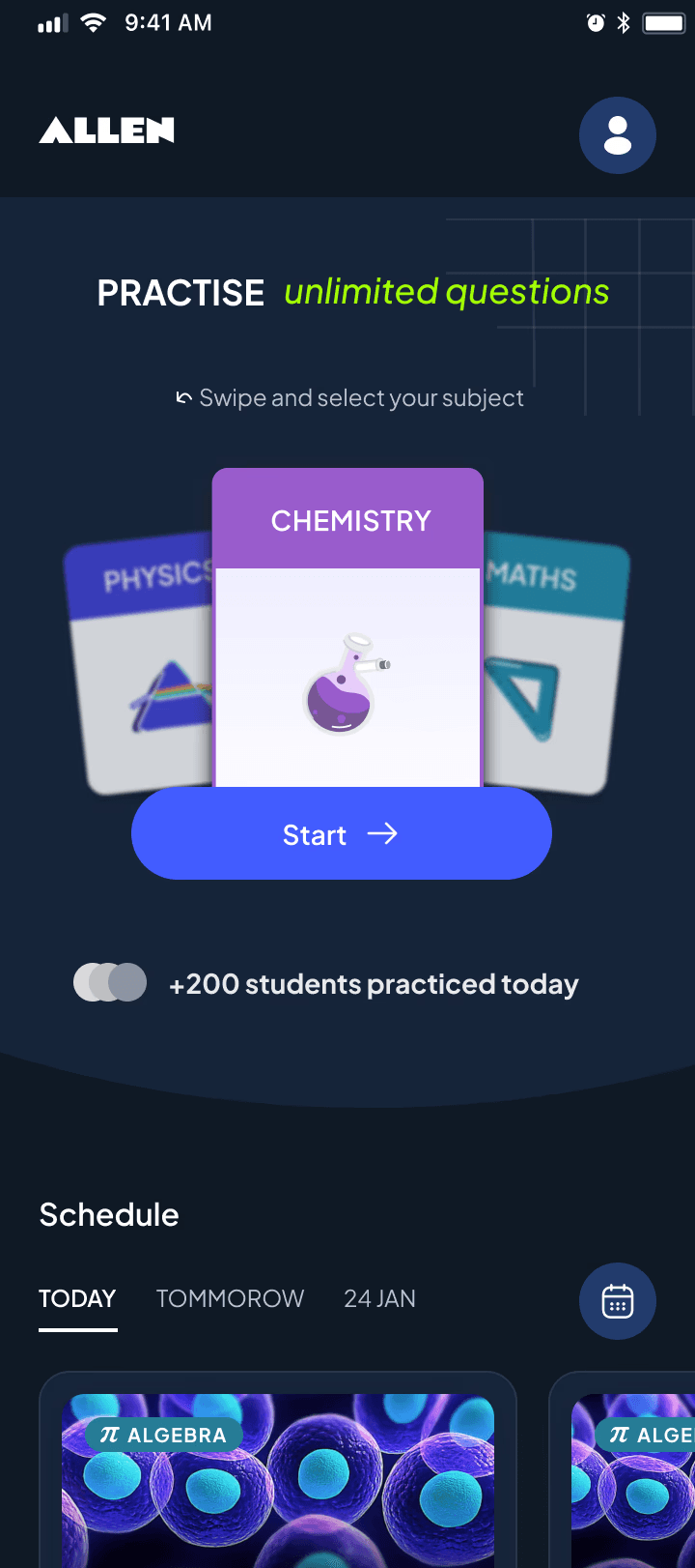
Different types of subject selections, buttons and success screens in production
1. Visual Entropy
With aggressive timelines. Designers were duplicating patterns rather than reusing them. I identified four different styles of "Subject Selection" cards live in production - each requiring separate maintenance.
The old style guide
A "Zombie" Style Guide
Our legacy guide was functionally obsolete. Token names were ambiguous (Blue-50 vs Light-Blue), and components lacked responsiveness. The library was actually slower to use than designing from scratch, leading designers to "eject" and create custom styles just to meet deadlines.
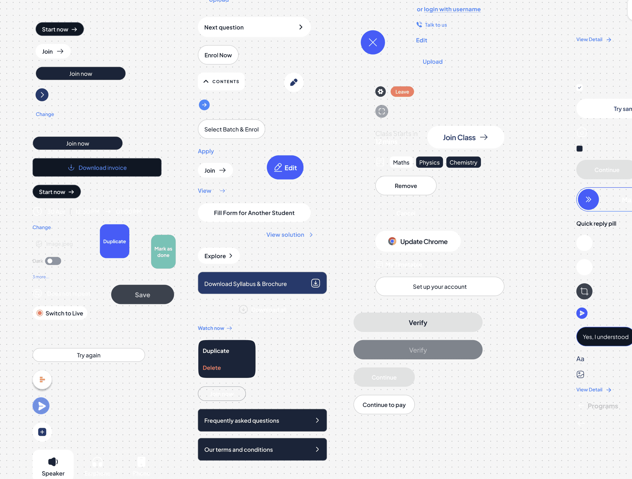
The inconsistency and feedback loop, captured in our button variants.
Opportunity Cost
Inconsistencies triggered cyclical debates between product and engineering on low leverage decisions like button sizes, colours, spacing, and more - turning simple updates into hours of pixel-pushing. This was time stolen from strategic feature work.
The build review was becoming another project in itself
The QA Bottleneck
Without tokenization, developers had to hard-code values manually.
The Review Tax: Design reviews became "spot the difference" exercises, correcting hundreds of hex-code mismatches.
Risk: The volume of visual bugs was so high that many reviews were abandoned, allowing defects to ship to production.
20%
CSAT for look and feel
Trust Erosion
The fragmented UI directly impacted retention. Qualitative feedback showed students preferred the legacy Allen Digital app, despite its dated visuals to the new Allen app simply because it was predictable. We were losing users not because of features, but because of friction. This also eroded the credibility of the Design team in front of other cross-functional teams.
To rebuild trust and improve outcomes, the product needed standardised tokens, components, and patterns across every experience.
To rebuild trust and improve outcomes, the product needed standardised tokens, components, and patterns across every experience.
To rebuild trust and improve outcomes, the product needed standardised tokens, components, and patterns across every experience.
02. The Strategy: Building the Case.
02. The Strategy: Building the Case.
02. The Strategy: Building the Case.
While my Director championed the high-level vision, we needed to align the organisation's "Triad" - Design, Engineering, and Product before we could write a single line of code. We approached this in three distinct stages.
While my Director championed the high-level vision, we needed to align the organisation's "Triad" - Design, Engineering, and Product before we could write a single line of code. We approached this in three distinct stages.
While my Director championed the high-level vision, we needed to align the organisation's "Triad" - Design, Engineering, and Product before we could write a single line of code. We approached this in three distinct stages.
Aligning Design : The "System Thinking" Workshop.
Our design team consisted largely of junior designers who were unfamiliar with Design Systems - specifically why they are necessary and how they function in a production environment. To bridge this knowledge gap and build advocacy, I facilitated a two-part workshop.
Part 1: The "Why" (Education):
We started with fundamentals. I walked the team through the ecosystem of a Design System, explaining how it eliminates repetitive work for both design and dev, and why a lack of standards degrades customer trust. The goal was to reframe the system as a toolkit that would make their lives easier.
Check presentation link here
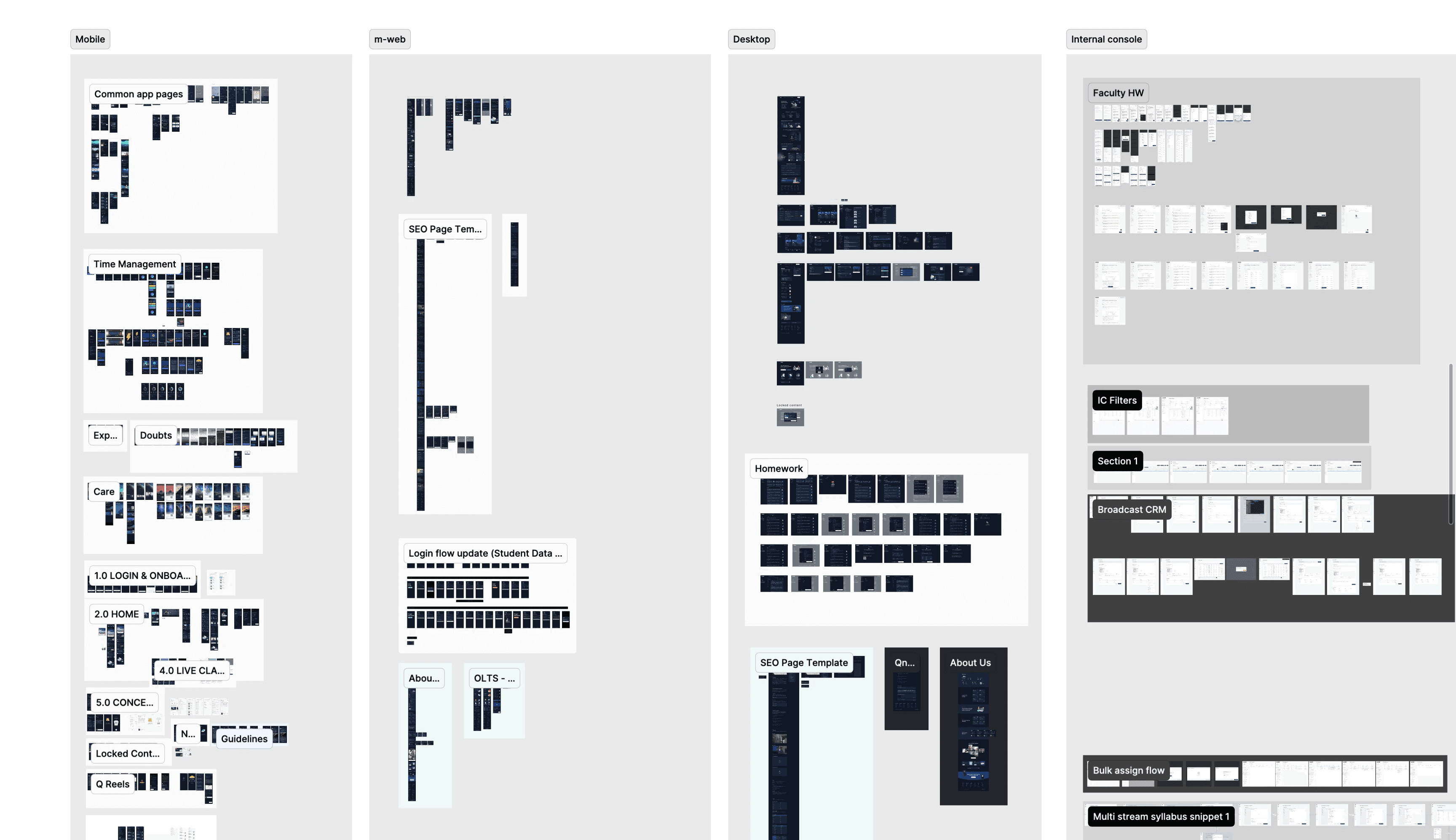
Screen dump for design system audit
Part 2: The "How" (Page Dump & Analysis):
We dumped our key flows on to a single page and laid them out side-by-side. The visual impact was undeniable; it looked like five different products stitched together. Using this chaos as a training ground, I guided the team through the three stages of systems thinking:
Identify: Spotting repeating patterns across different features.
Categorize: Grouping similar elements (e.g., "these 5 cards are actually the same component").
Structure: Defining the anatomy of a standardized component.
The Audit Results: Following the session, I formally audited the grouped "dump." The data confirmed the severity of our fragmentation:
Across 1600+ screens, we found 100+ font styles, colours, gradients and components, with the button alone having 20+ variations across the platform.
2. Aligning Engineering: The Technical Pitch.
Armed with the data from the Audit, I approached the Engineering Leads. They were initially hesitant to divert resources from feature work, so I used the "Page Dump" to frame the system as a technical necessity rather than a visual upgrade.
Armed with the data from the Audit, I approached the Engineering Leads. They were initially hesitant to divert resources from feature work, so I used the "Page Dump" to frame the system as a technical necessity rather than a visual upgrade.
Codebase Hygiene: I showed them the 100+ font sizes and explained that this visual fragmentation mirrored the spaghetti code in their CSS. I pitched the system as an architectural cleanup to reduce technical debt.
Efficiency Contract: I promised that the system would end the "QA Ping-Pong." By standardising tokens, we would stop wasting 20% of sprint time debating pixel values.
The Buy-in: Seeing the raw data changed their perspective. They realised that the current approach was unsustainable and agreed to support the system with "borrowed bandwidth" if approved by leadership.
Aligning Product: The OpEx Pitch.
The final hurdle was the Product Head, who held the budget. While Vinu led this pitch, I supplied the tactical evidence he needed to substantiate the business case.
The final hurdle was the Product Head, who held the budget. While Vinu led this pitch, I supplied the tactical evidence he needed to substantiate the business case.
The Evidence: I provided the raw data from our Technical Audit - specifically the "100 font sizes" and "20 button variations" to prove that the application was structurally broken.
The Business Case: Vinu used this data to translate "visual inconsistency" into "Operating Expense". He demonstrated to the Product Head that this fragmentation was inflating development time, and that a system would drastically reduce future manpower requirements.
The Leverage: Together, we linked this fragmentation to the alarmingly low 20% CSAT score, proving that we couldn't fix user trust without fixing the UI foundation.
03. Implementation: The Phased Rollout.
03. Implementation: The Phased Rollout.
Given we had no dedicated engineering team, I handled the architecture and design work, relying on "borrowed bandwidth" from feature developers for implementation.
Given we had no dedicated engineering team, I handled the architecture and design work, relying on "borrowed bandwidth" from feature developers for implementation.
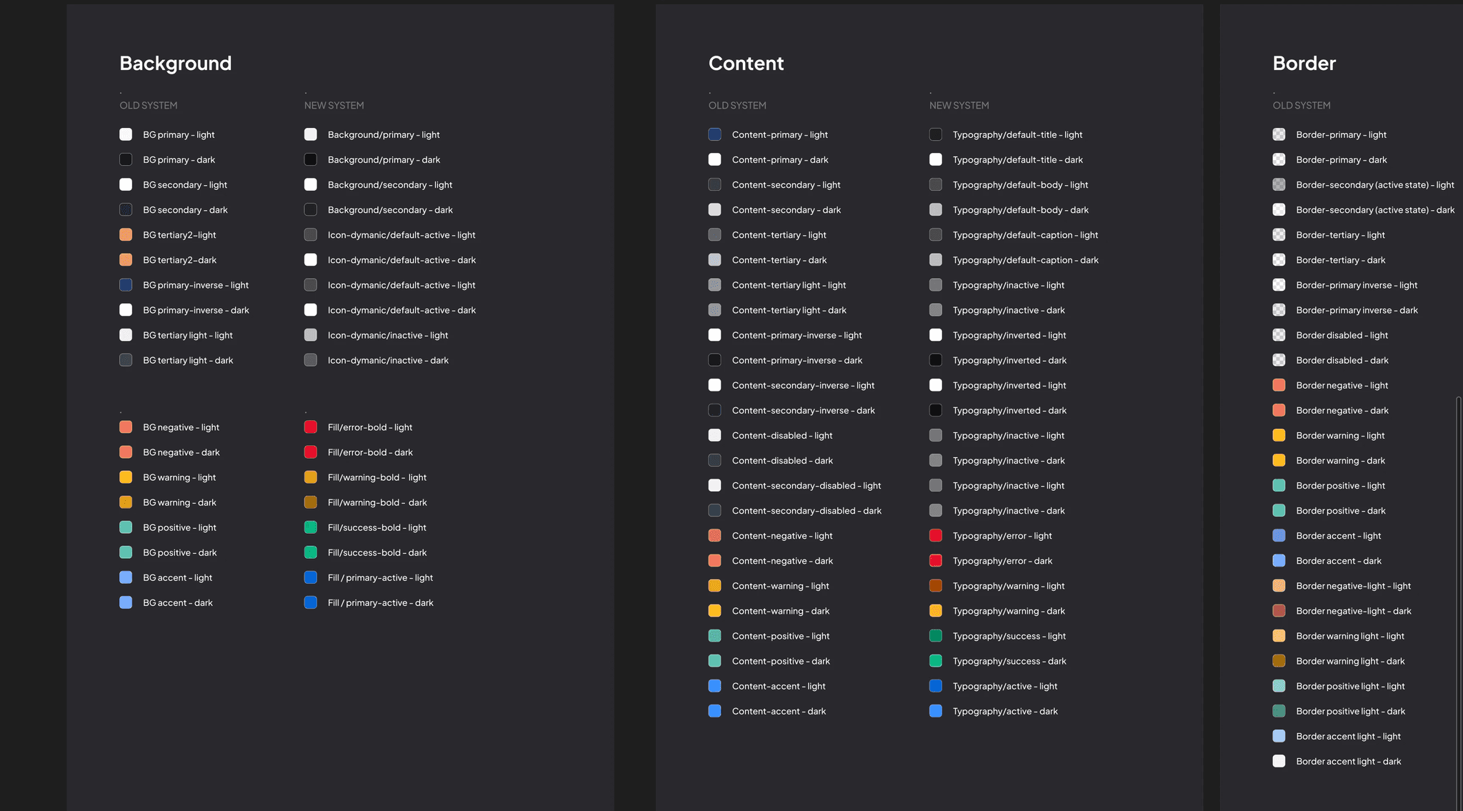
Mapping old colours to new ones
Phase 1 : Foundations & The Semantic Refactor
Scope: Colour, Typography, and the Button Component.
The Strategy: We deliberately prioritised these three elements because they represent the highest-frequency patterns in the UI. By fixing the "atoms" that appear on every single pixel, we could standardise 80% of the visual experience without needing to refactor complex logic immediately.
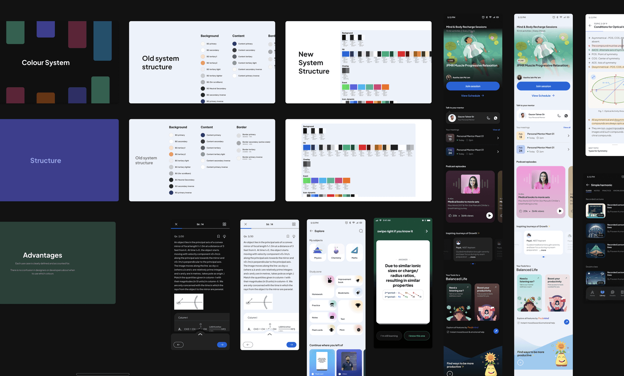
New colour structure presentation with example screens
Securing the Bandwidth:
Since a full semantic refactor required significant developer time, we needed explicit approval from the Product Head.
The Pitch: We presented a side-by-side comparison: the messy, logic-less old palette vs. the new, structured semantic system.
The Sell: We demonstrated that the new structure wasn't just "cleaner" - it was predictable. We showed example screens proving that the new tokens would drastically speed up decision-making for both designers and developers. This clarity convinced leadership to allocate the necessary sprint capacity.
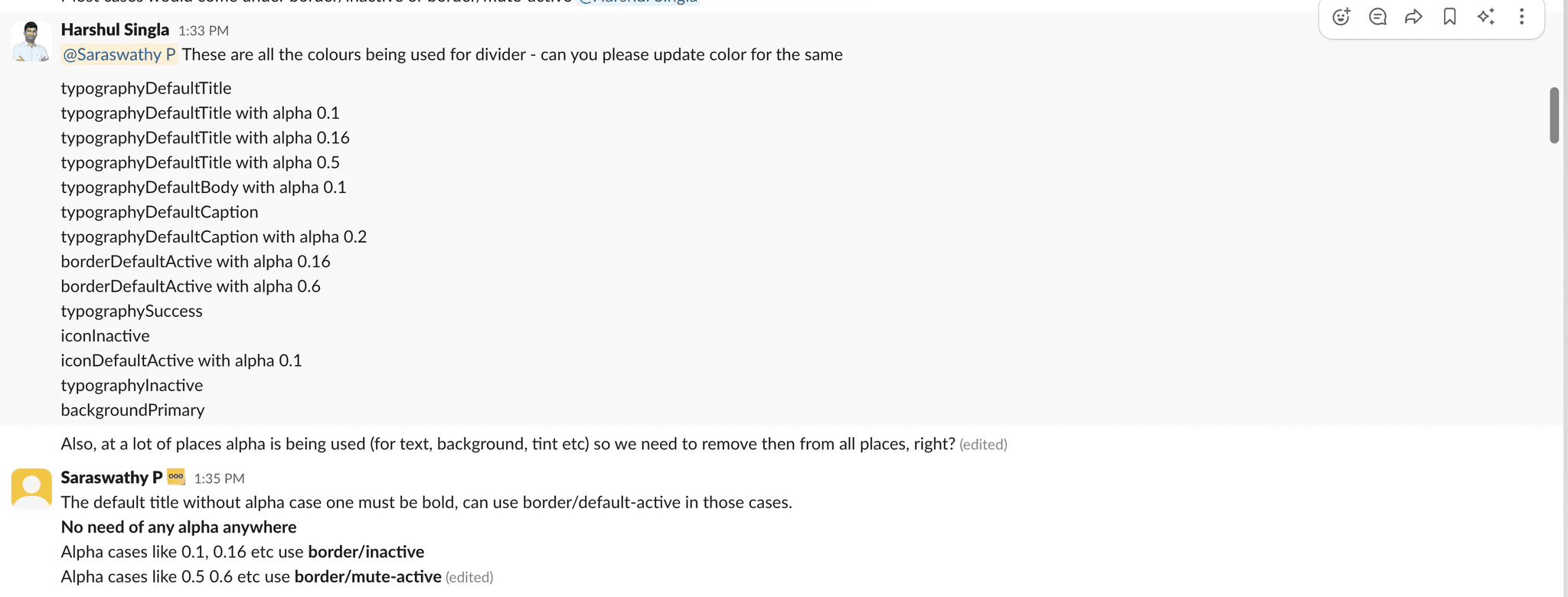
Slack channel fix : 14 colours from typography, icon, background that had been used for border colour in old colour system
Engineering leadership proposed "aliasing" the old legacy colour tokens to the new system to save time as the old system already supported theming. I advocated against this, demonstrating that the legacy logic was fundamentally flawed (e.g., background tokens applied to icon strokes). We agreed to pay the cost of a complete semantic refactor.
The Execution
Manual Migration: I worked directly with developers in a dedicated Slack channel to map old hex codes to new semantic tokens on the fly.
QA Tracking: Used Google Sheets to log bugs and track which pages were fixed
Debt Containment: We skipped the complex "Live Class" pages to ensure we shipped on time, tagging them to be fixed later.
Typography with a 1:1 mapping between devices
For type, we architected a strictly mirrored system between Desktop and Mobile. By ensuring every Desktop token had a direct Mobile equivalent, we eliminated the guesswork in translation, making responsive implementation automatic for developers. We also implemented button component.
The Win: Despite the partial rollout, standardising these core foundations caused CSAT to jump from 20% to 60% in one quarter.
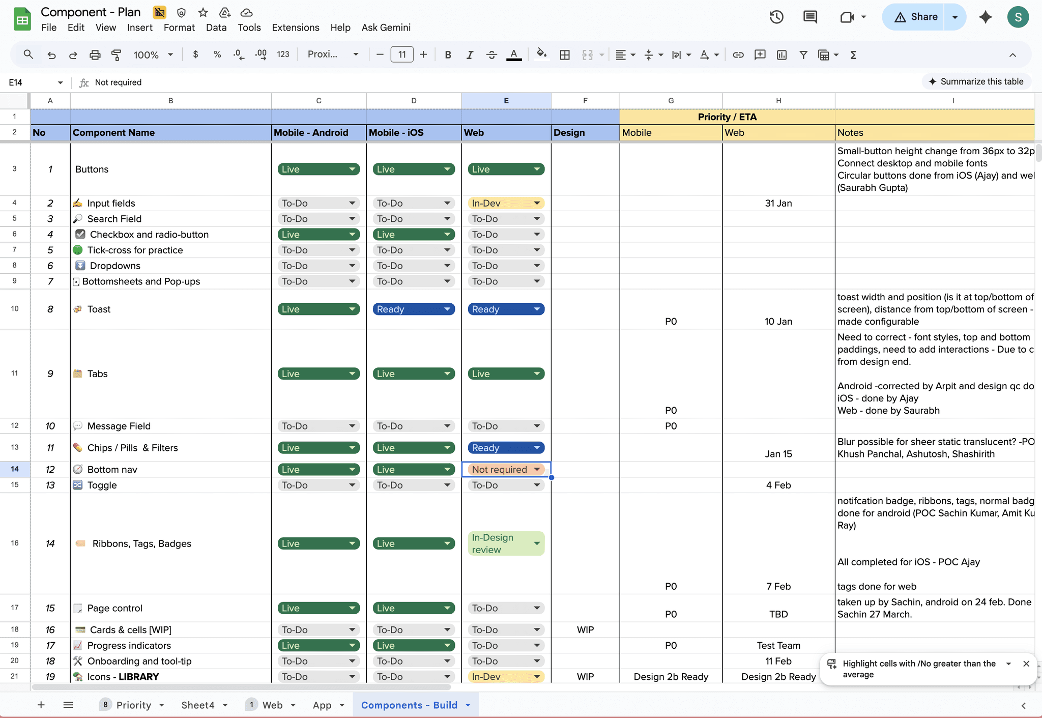
Component library build tracking
Phase 2 : Building the component library
Once the tokens and buttons were solidified, we moved to the rest of the component library.
The Strategy: We prioritised components based on frequency of use. I designed "state-complete" components defining not just the "Happy Path" but standardised Focus States, Error States, and Loading States upfront.
The Execution: Developers picked these up during spare cycles. We tracked progress closely using a shared status sheet.
The Impact: As each new component was merged, it replaced dozens of inconsistent hard-coded versions.

Fixing L0 pages according to system guidelines
Phase 3: Applying guidelines to the core pages
With the system taking shape, we began applying our guidelines to the app’s "L0" screens.
The Scope: We moved beyond component replacement to fix the foundational structure. We standardised the grid system, corner radii, and typographic hierarchy across Mobile, Tablet and Desktop.
The Result: Updating these high-visibility pages brought immediate visual consistency to the user's first impression, making the app feel significantly more polished and predictable.
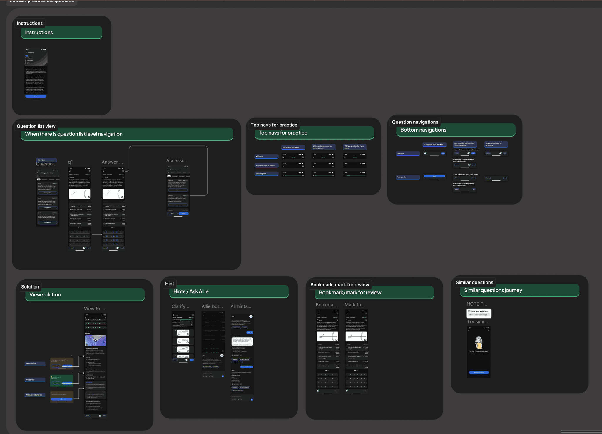
Practice broken into modular flows
Phase 4: Fixing major patterns
We then tackled the most widely used patterns across the app starting with the practice experience. Because it powered multiple features, fixing this one flow would resolve nearly half of our usability issues.
We redesigned it as a modular system where each part of the experience could be turned on or off based on a feature’s needs. This made the pattern reusable, predictable, and far easier for teams to implement bringing consistency to one of the most critical user journeys.
Old colour iterations for the system
Old colour iterations for the system
04. Governance: Operationalizing the System.
Building the system was one challenge; getting the organization to use it was another. Early adoption was slow, and designers were asking for feedback too late in the process.
Building the system was one challenge; getting the organization to use it was another. Early adoption was slow, and designers were asking for feedback too late in the process.
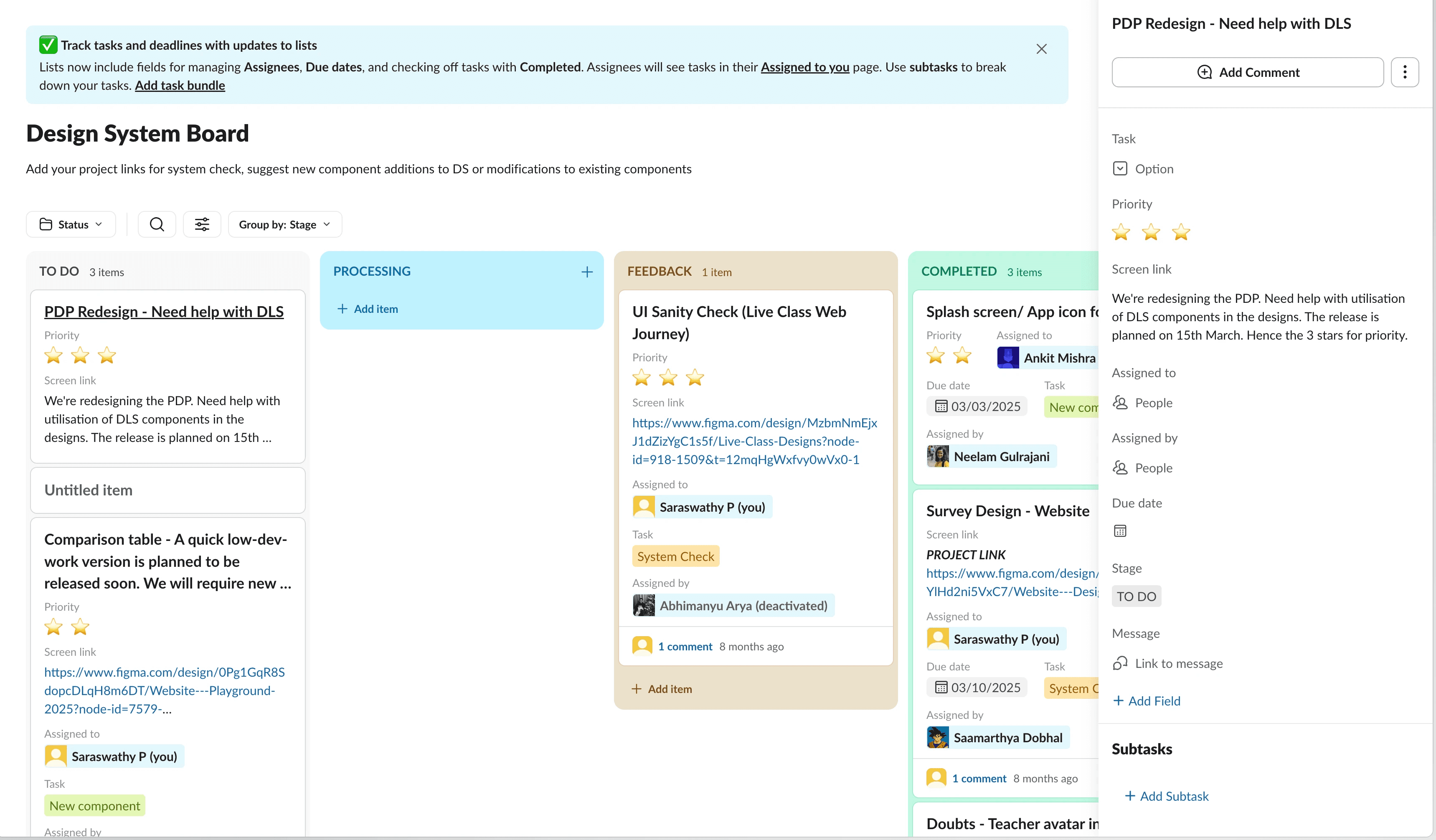
The System Board.
To fix this upstream, we created a governance workflow on Slack with a "System Board" to track all DS-related requests.
To fix this upstream, we created a governance workflow on Slack with a "System Board" to track all DS-related requests.
The Checkpoint: Rather than policing, we framed this as a service. Designers requested a "System Check" to ensure they were using existing components correctly before high-fidelity work began.
Centralised Tracking: We used the board to centralise component requests, bug reports, and usage questions. This gave us visibility into where the system was failing the team, allowing us to prioritise updates based on real friction points.
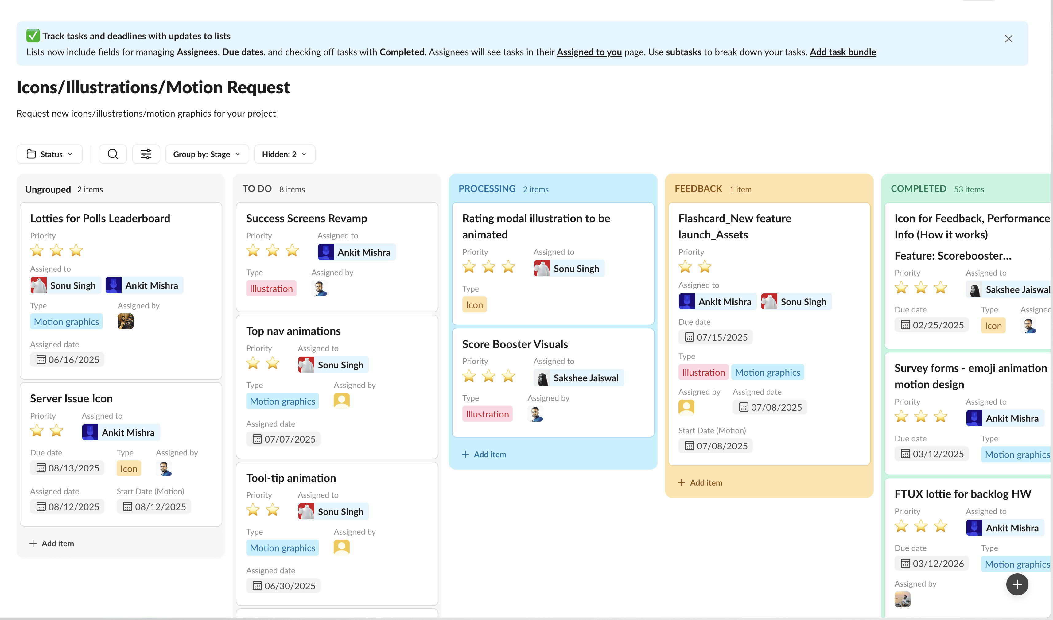
Streamlining Visual Assets.
Noticing that the visual design team was getting flooded with ad-hoc, unprioritised requests from multiple pods, we also created a visual asset request workflow
Noticing that the visual design team was getting flooded with ad-hoc, unprioritised requests from multiple pods, we also created a visual asset request workflow
By streamlining requests through the board, we filtered out low-value requests and allowed the visual design team to work effectively, ensuring that every asset entering the codebase met our new quality standards.
By streamlining requests through the board, we filtered out low-value requests and allowed the visual design team to work effectively, ensuring that every asset entering the codebase met our new quality standards.
The eventual win - CSAT improves.
Our efforts slowly, but surely began to yield results as the CSAT for look and feel of the app improved.
Our efforts slowly, but surely began to yield results as the CSAT for look and feel of the app improved.
20%
20%
2023
2023
60%
60%
Jun 2024
Jun 2024
75%
Jan 2025
Jan 2025
93.2%
July 2025
July 2025
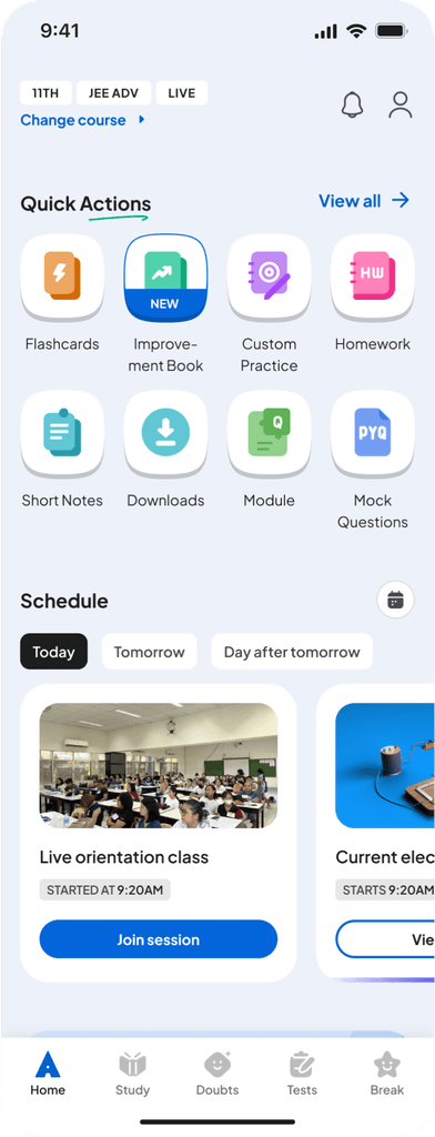
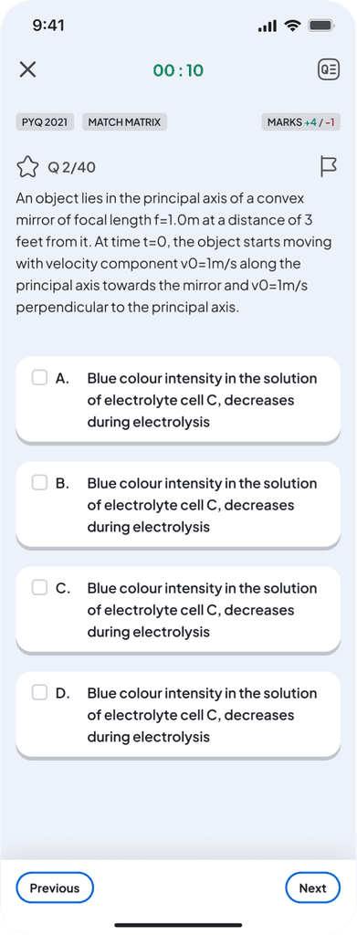
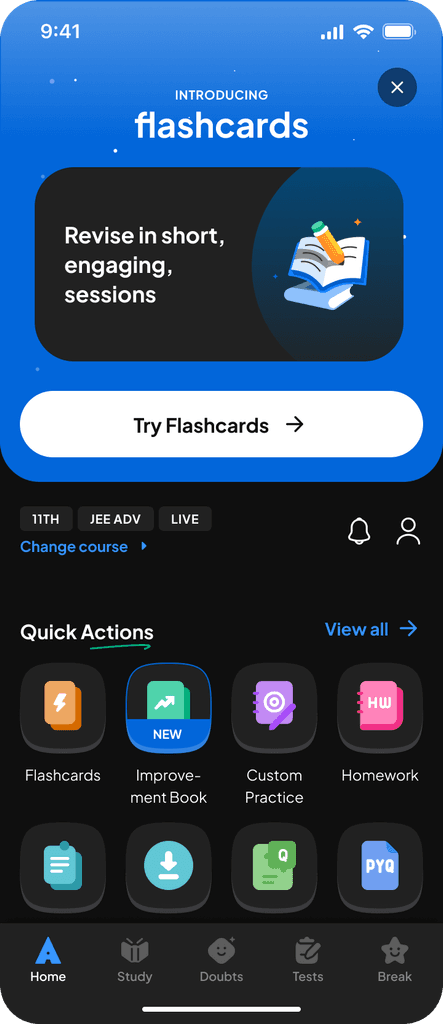
Our app before implementation of DLS.
Our app before implementation of DLS.


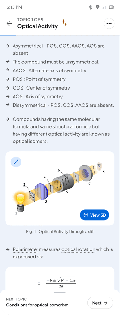
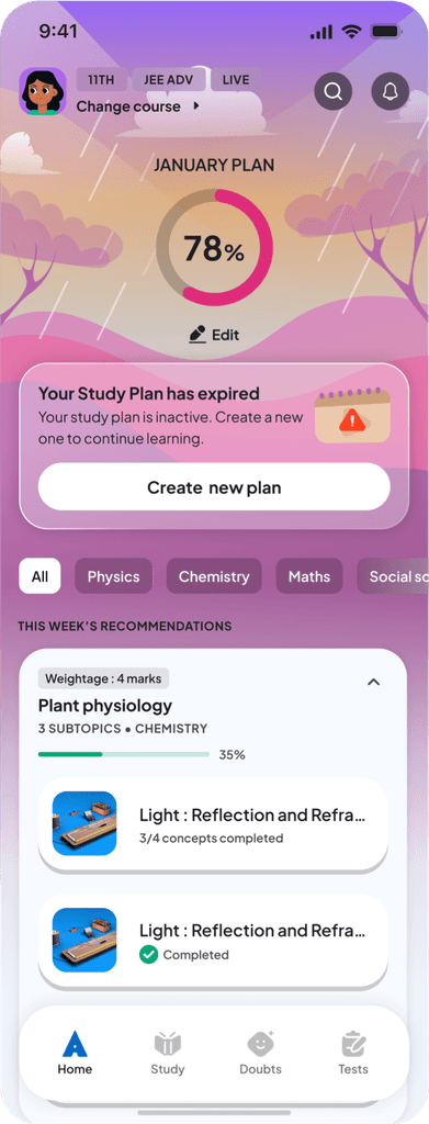
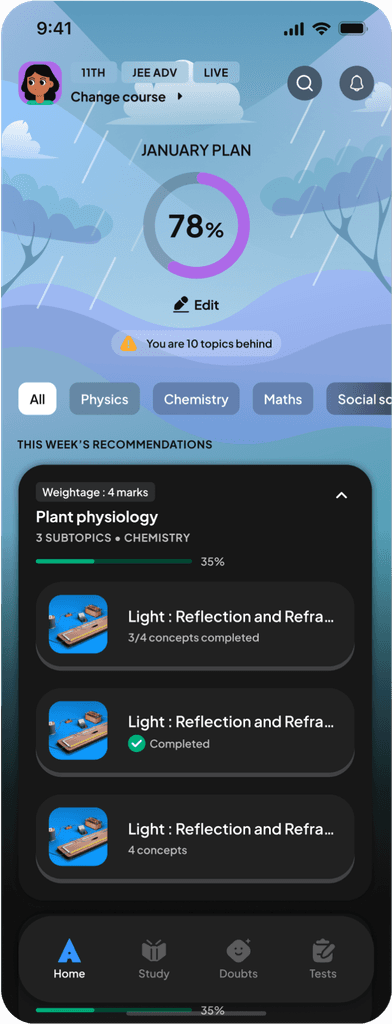
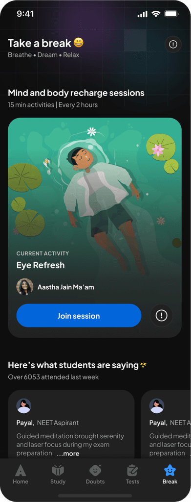
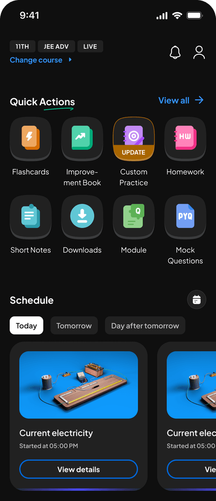
App post implementation of DLS.
App post implementation of DLS.
App post implementation of DLS.
05. The Win: Outcomes & Impact.
The system shifted our culture from "accumulating debt" to "building equity." Beyond just visual consistency, we achieved measurable operational efficiency.
93.2%
CSAT on look and feel
3-4 hours
saved per day per person
45+
core components
40-50K
Inserts per week
1. Impact on User Trust (CSAT)
The most tangible validation was the restoration of user trust. As we rolled out the system, the CSAT score for "Look and Feel" tracked upward in direct correlation to the reduction of inconsistency growing from 20% in 2023 to 93.2% in July, 2025.
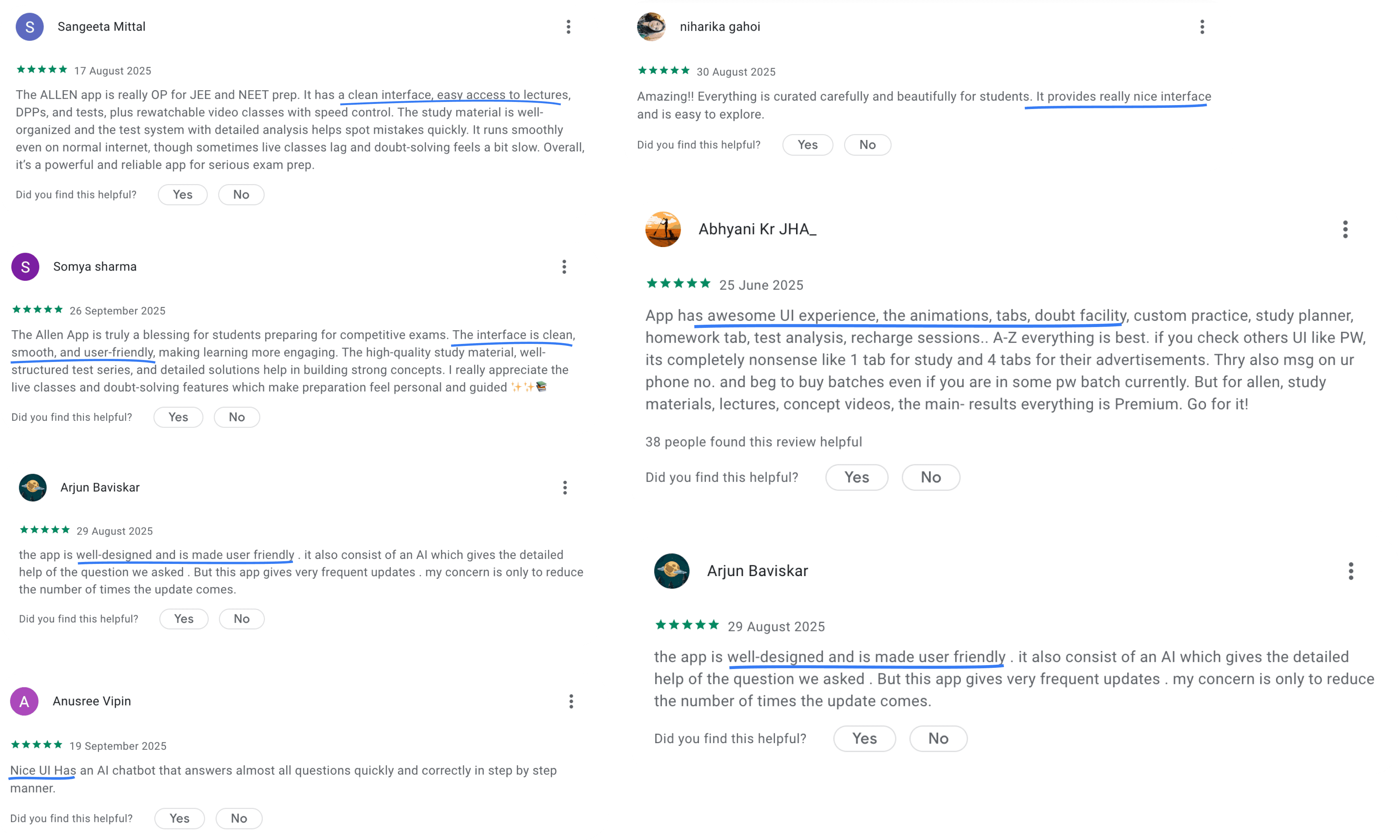
Impact: User sentiment shifted from "frustration with bugs" to "delight with polish" as demonstrated by user reviews.
2. Operational Efficiency
We conducted an internal survey with engineering and design teams to quantify the time saved by eliminating manual specs and CSS rewriting. Time Saved came to around 3-4 hours per person, per day. Over the course of a year, this effectively reclaimed thousands of engineering and design hours allowing us to ship features faster without increasing headcount.
3. System Adoption & Scale
The system isn't just a reference; it is the daily toolkit for the entire org. We currently track 40,000 - 50,000 component inserts per week in Figma. This proves that the system is not a bottleneck, but an accelerator.
4. Technical Debt Reduction
The audit had uncovered over 300+ fragmented UI elements. Through rigorous standardisation, we consolidated this chaos into a lean, robust library of just 45 Core Components. We did more with less.
User reviews on Play Store :
05. The Win: Outcomes & Impact.
The system shifted our culture from "accumulating debt" to "building equity." Beyond just visual consistency, we achieved measurable operational efficiency.
93.2%
CSAT on look and feel
3-4 hours
saved per day per person
45+
core components
40-50K
Inserts per week
1. Impact on User Trust (CSAT)
The most tangible validation was the restoration of user trust. As we rolled out the system, the CSAT score for "Look and Feel" tracked upward in direct correlation to the reduction of inconsistency growing from 20% in 2023 to 93.2% in July, 2025.
Impact: User sentiment shifted from "frustration with bugs" to "delight with polish" as demonstrated by user reviews.
2. Operational Efficiency
We conducted an internal survey with engineering and design teams to quantify the time saved by eliminating manual specs and CSS rewriting. Time Saved:3-4 hours per person, per day. Over the course of a year, this effectively reclaimed thousands of engineering and design hours allowing us to ship features faster without increasing headcount.
3. System Adoption & Scale
The system isn't just a reference; it is the daily toolkit for the entire org. We currently track 40,000 - 50,000 component inserts per week in Figma. This proves that the system is not a bottleneck, but an accelerator.
4. Technical Debt Reduction
The audit had uncovered over 300+ fragmented UI elements. Through rigorous standardisation, we consolidated this chaos into a lean, robust library of just 45 Core Components. We did more with less.
User reviews on Play Store :
Key learnings.
1. Architectural shortcuts are expensive
I learned to stand firm on structural integrity. Accepting the engineering proposal to "alias" old tokens would have saved two weeks upfront but permanently locked us into broken logic. Refactoring a live system later is exponentially harder than building it right the first time.
2. Processes build habits; habits build quality
Adoption didn't happen by accident; it happened because we mandated a workflow. by establishing the "System Check" before developer handoff, we forced a habit change. Once Engineering refused to build tickets without that check, consistency became automatic rather than negotiated.
3. Failure: Visibility requires active PR
My biggest failure was assuming the work would speak for itself. I didn't talk about the system enough in public forums or company all-hands. I learned that building the tool is only half the job; you must actively broadcast the wins to leadership and the wider org to maintain momentum and morale.
Strategic Prioritization over 100% Coverage.
We deliberately skipped the "Live Class" pages to meet our deadline. I learned that a successful rollout requires making hard trade-offs. Shipping a system that fixes 80% of the app immediately provided more business value than delaying the release to fix edge cases.
The team.
Lead by
Vinu Remesan
My role
Design tokens
Colour
Aa
Aa
Aa
Aa
Aa
Aa
Typography
Elevation
8px
16px
24px
Spacing
Corner radius
com
Components
Patterns
Icon library
Structures and processes
Layout grids
Training
Guidelines
Management
Sonu Singh
Motion
Sakshee Jaiswal & Ankit Mishra
Icon library
Illustration library
Development
Harshul Singla
Ashutosh Lasod
Ajay Nellori
Sachin Kumar
Sourabh Gupta
Shashirith P
and many more…
The team.
Lead by
Vinu Remesan
My role
Design tokens
Colour
Aa
Aa
Aa
Aa
Aa
Aa
Typography
Elevation
8px
16px
24px
Spacing
8px
16px
24px
Spacing
Corner radius
com
Components
Icon library
Patterns
Structures and processes
Layout grids
Training
Guidelines
Management
Sonu Singh
Motion
Sakshee Jaiswal & Ankit Mishra
Icon library
Illustration library
Development
Harshul Singla
Ashutosh Lasod
Ajay Nellori
Sachin Kumar
Sourabh Gupta
Shashirith P
and many more…
A Glipse into the Allen DLS.
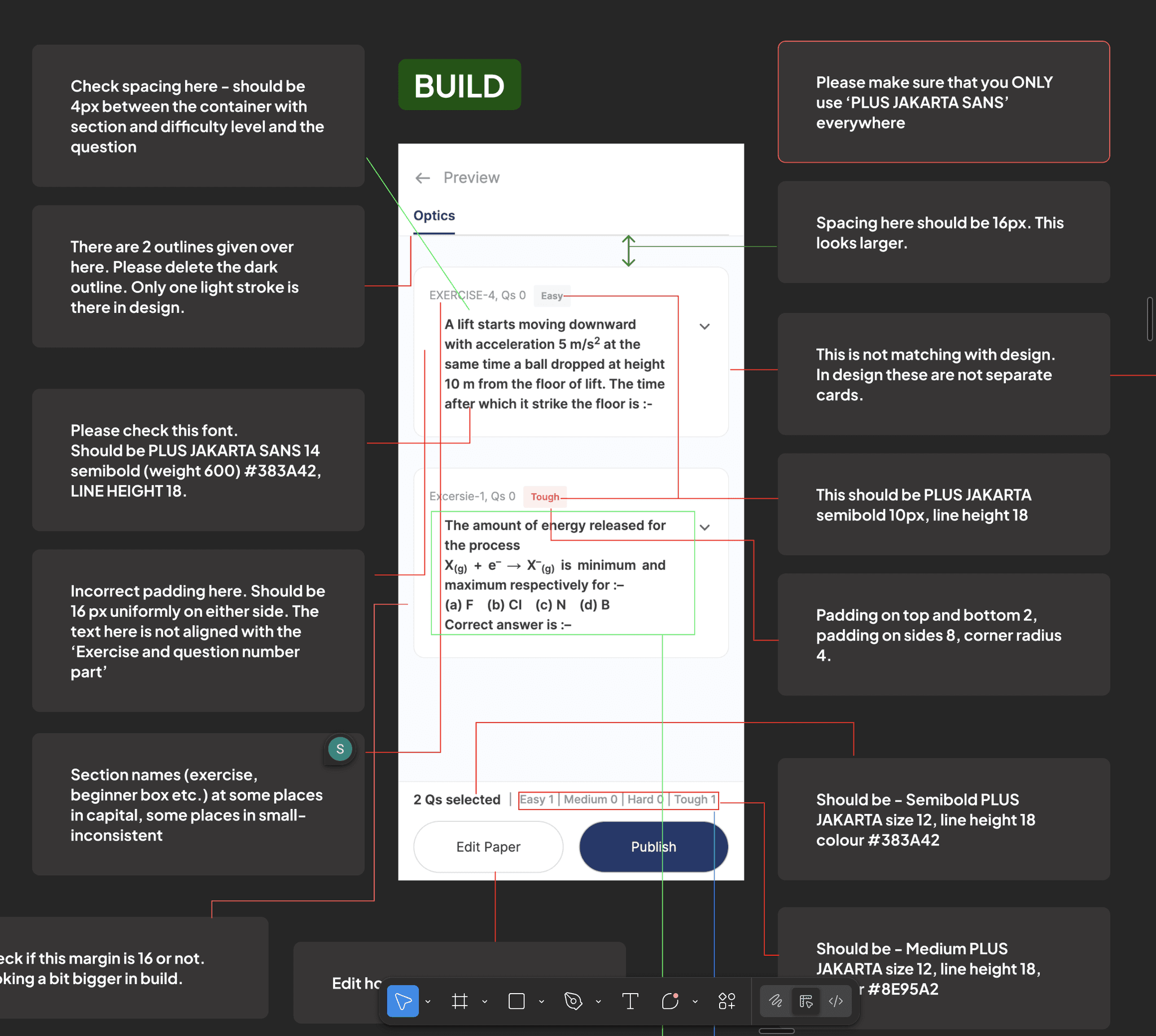
Fellow Design System geeks - let’s connect and geek out over the technicalities and nitty-gritties of building a system :D
Fellow Design System geeks - let’s connect and geek out over the technicalities and nitty-gritties of building a system :D
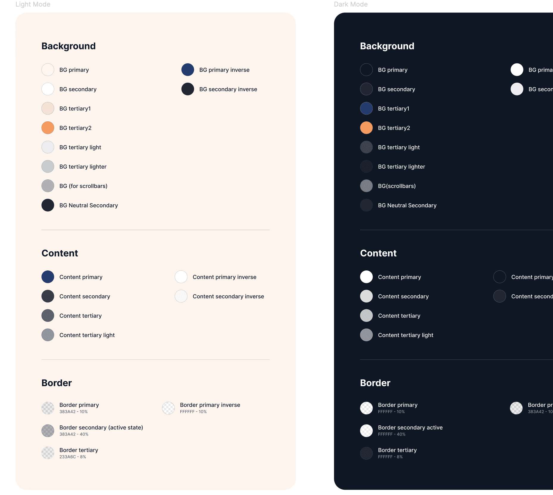
Our colour system with simple semantic naming and categorisation
Our colour system with simple semantic naming and categorisation
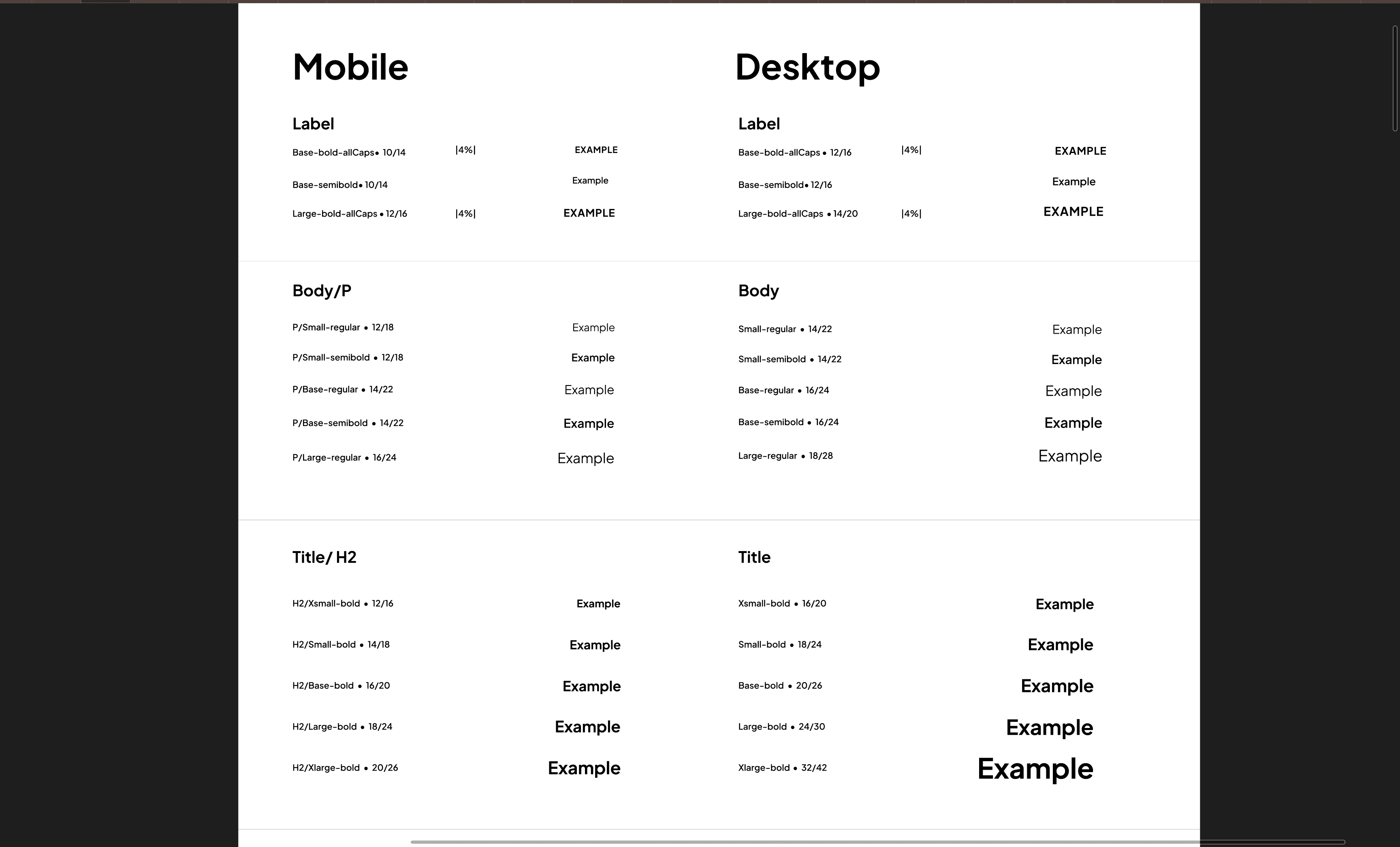
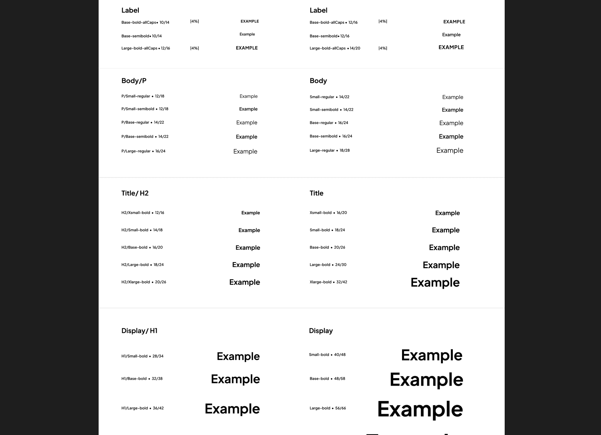
Our typography library : Typography styles were connected to variables to create device modes and massively reduce time to adapt designs across devices.
Our typography library : Typography styles were connected to variables to create device modes and massively reduce time to adapt designs across devices.
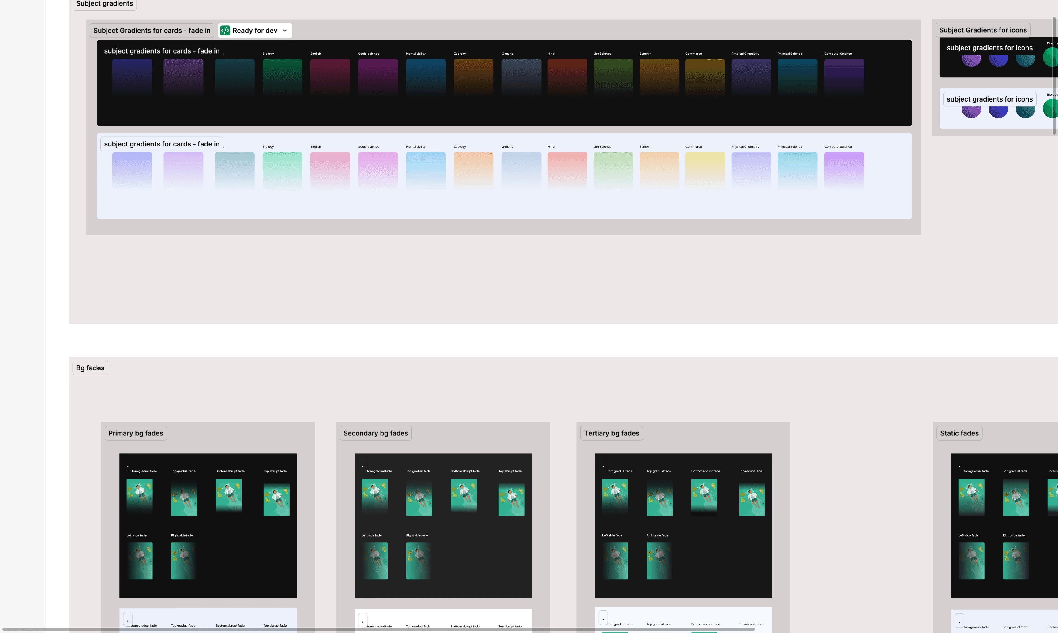
Our gradient systems - connected to variables to automatically change colours from dark to light modes.
Our gradient systems - connected to variables to automatically change colours from dark to light modes.
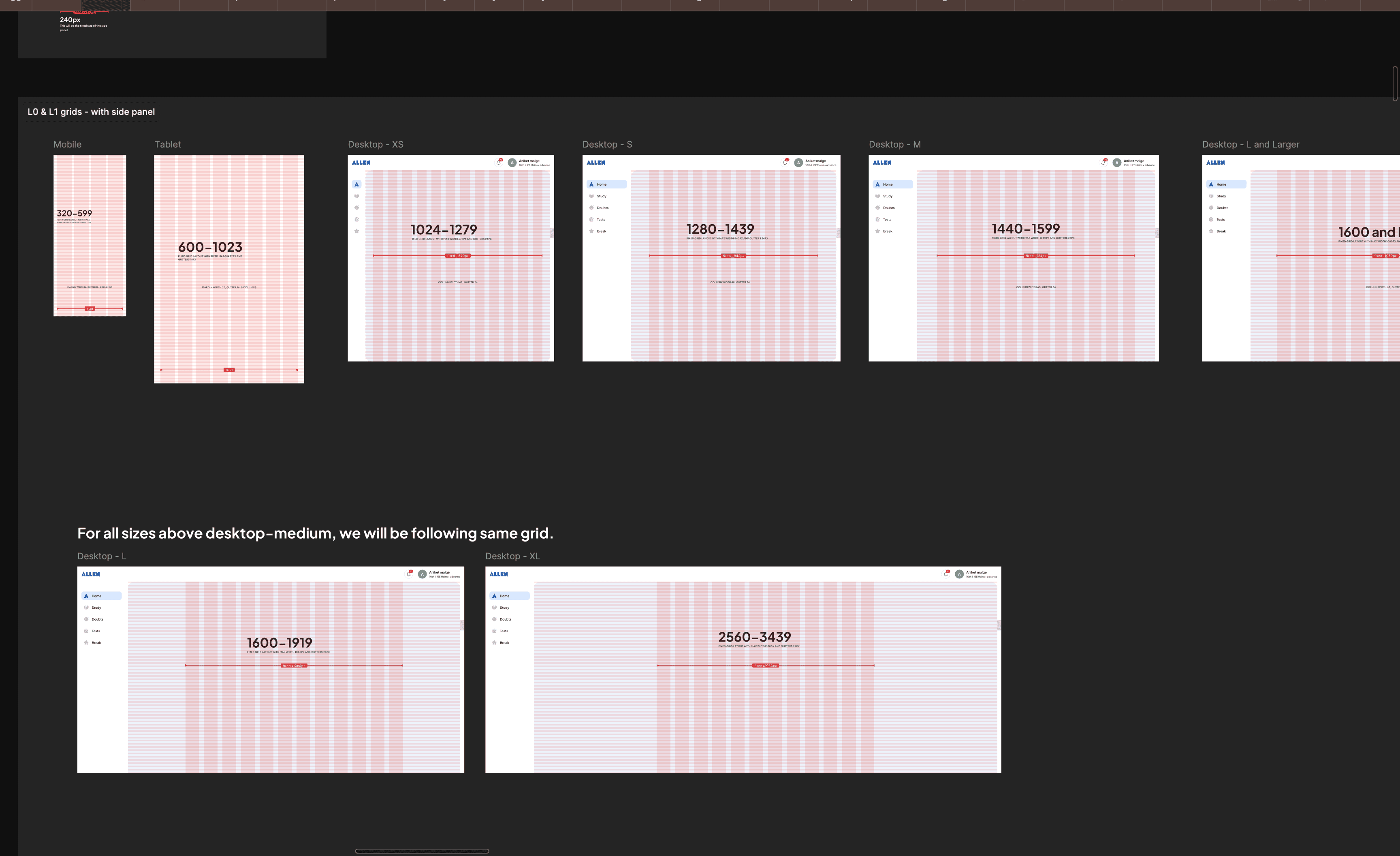
Our grid system - designed to be flexible or fixed, to best fit our content type.
Our grid system - designed to be flexible or fixed, to best fit our content type.
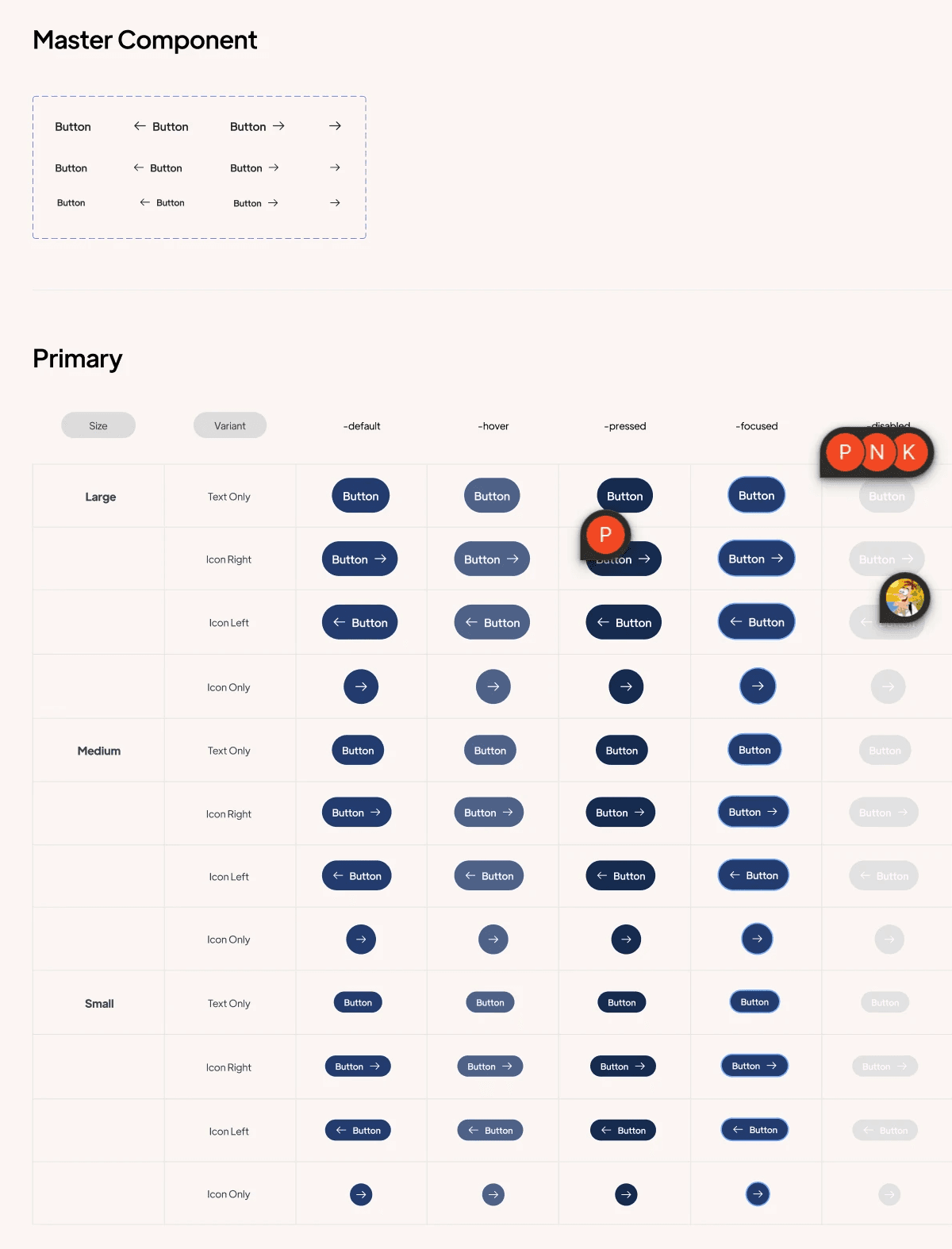
An example of our extensive documentation for components.
An example of our extensive documentation for components.
Open to new ideas, learnings and coffee chats.
+91 9667319653
saraswathyp.design@gmail.com
Made with love on Framer
© SARASWATHY 2025
Open to new ideas, learnings and coffee chats.
+91 9667319653
saraswathyp.design@gmail.com
Made with love on Framer
© SARASWATHY 2025
Open to new ideas, learnings and coffee chats.
+91 9667319653
saraswathyp.design@gmail.com
Made with love on Framer
© SARASWATHY 2025